
Account-level workflow insights
A quick overview of your account-level workflows analytics dashboard
See a snapshot of how all your automated emails perform, how subscribers engage with workflows over time, and which workflow subscribers unsubscribe from the most.
In this article, you’ll learn
how to access your account-level workflows analytics dashboard,
what type of information you can find on the various chart types, and
how to export the data contained within the current chart views
Where can I find the Workflow analytics dashboard?
To access the account-level workflows analytics dashboard, click the Analytics tab in the top navigation bar, then select the Workflows page view.
Important: Drilled-down analytics of a specific workflow continue to live within the Workflow tab.
To see the performance of a particular workflow, read How can I see how my workflow performed?
What kind of data can I find on the Workflow analytics dashboard?
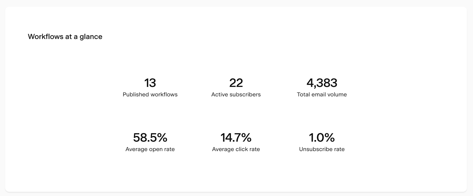
Workflows at a glance metric card
On the top of the Workflows analytics page, the Workflows at a glance metrics card gives you a quick overview of your:
Published workflows: Count of published workflows
Active subscribers: Count of subscribers currently active in a workflow
Total email volume: Count of the total number of email volume sent through all workflows over time
Average open rate: Average open rate of all workflow emails
Average click rate: Average click rate of all workflow emails
Unsubscribe rate: Average unsubscribe rate of all workflow emails
Workflow activity bar chart
The following chart on the page is a bar chart showing Workflow activity. Use the below controls to fine-tune your data view.
(1) Metric drop-down:
This drop-down lets you pick the metric (#) represented by the chart's bar height. The scale for this metric is set on the left side of the chart.
You can select:
Total email volume: Count of workflow emails sent (volume) within the selected timeframe.
Subscriber entries: Count of subscribers who entered workflow within the selected timeframe.
Subscriber completions: Count of subscribers who completed workflow within the selected timeframe.
(2) Group-by toggle:
Click the Show individual workflows toggle on your bar chart to switch between a high-level overview of the data and data broken down by subgroup. The selection here sets the bar color and bar color legend at the bottom of the chart.
(3) Time period selector:
Use this to select the time unit the data is viewed by (i.e. Daily or Weekly) as well as the time period of the overall chart (i.e. Last 30 days or 12 weeks).
There are preset chart time periods based on the unit selection and the option to select a custom timeframe.
Daily: 7 days, 14 days, 30 days, Custom
Weekly: 8 weeks, 12 weeks, 24 weeks, Custom
Monthly: 6 months, 12 months, 24 months, Custom
Yearly: All years
Important: all data is displayed based on the timezone you have set in your account settings.
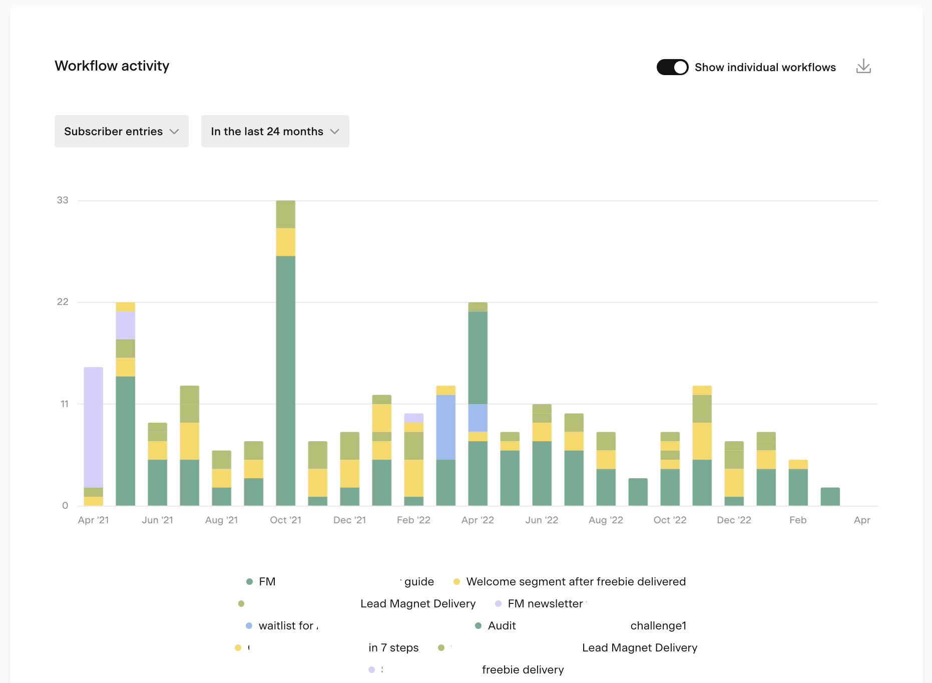
Pro tip: To look at the activity of a specific workflow, simply click other items in the legend at the bottom of the chart to turn them off.
When you hover over a bar or section of a bar (when the group-by toggle is turned on), a tooltip details the data contained within that section.
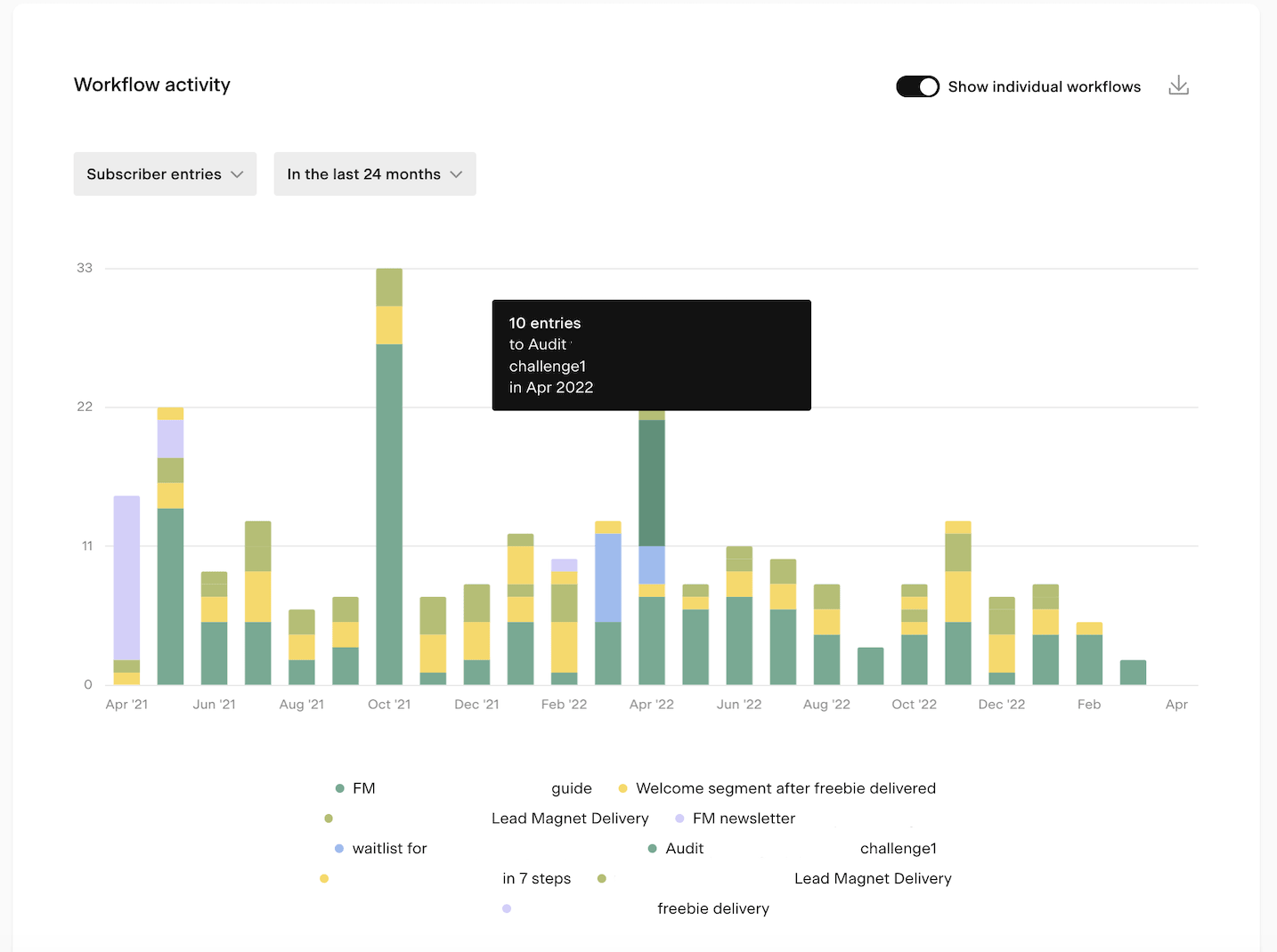
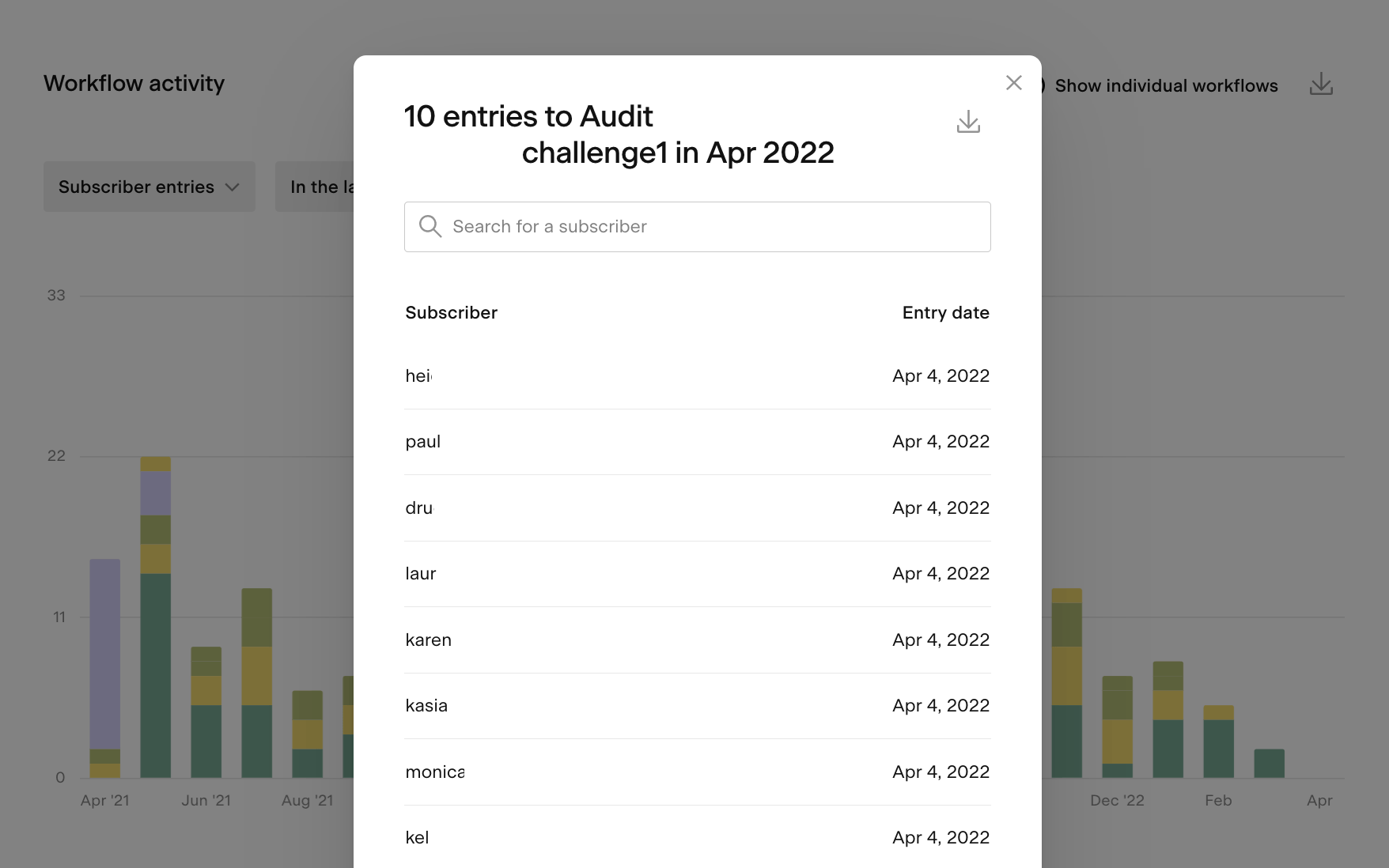
If you click on the same selection, a modal will open that details the data contained within the selection. You can also export this data view into a CSV file.
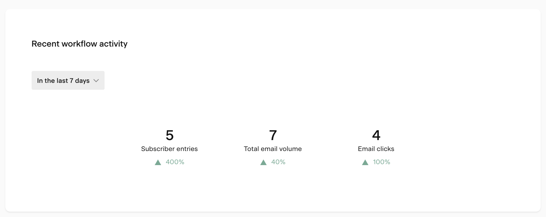
Recent workflow activity comparative metric chart
The following chart on the page is a comparative metric chart called Recent workflow activity. It displays the positive or negative trend (% increase or decrease) of a metric for a selected period (last 7 or last 30 complete days) compared to the previous period (previous 7 or previous 30 days).
You’ll find the following metrics set on this chart:
Subscriber entries: Count of workflow entries within the selected timeframe
Total email volume: Count of workflow email volume within the selected timeframe
Open rate: Open rate across workflow emails within the selected timeframe
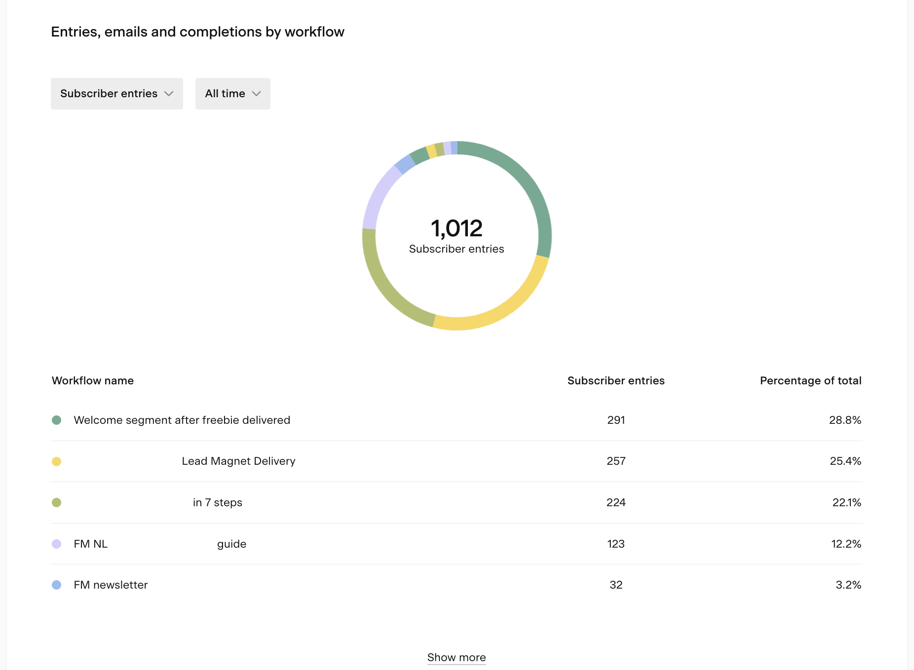
Entries, emails and completions by workflow pie chart
The Entries, emails and completions by workflow pie chart shows the following metrics broken down by workflow for the selected timeframe:
Total email volume: Count of emails sent (volume) by workflow within the selected timeframe.
Subscriber entries: Count of subscriber entries by workflow within the selected timeframe.
Subscriber completions: Count of subscriber completions by workflow within the selected timeframe.
You can pick the following timeframes in the drop-down:
In the last 7 days,
In the last 30 days,
All time.
For example, the chart below shows how many subscribers have entered various workflows until now.
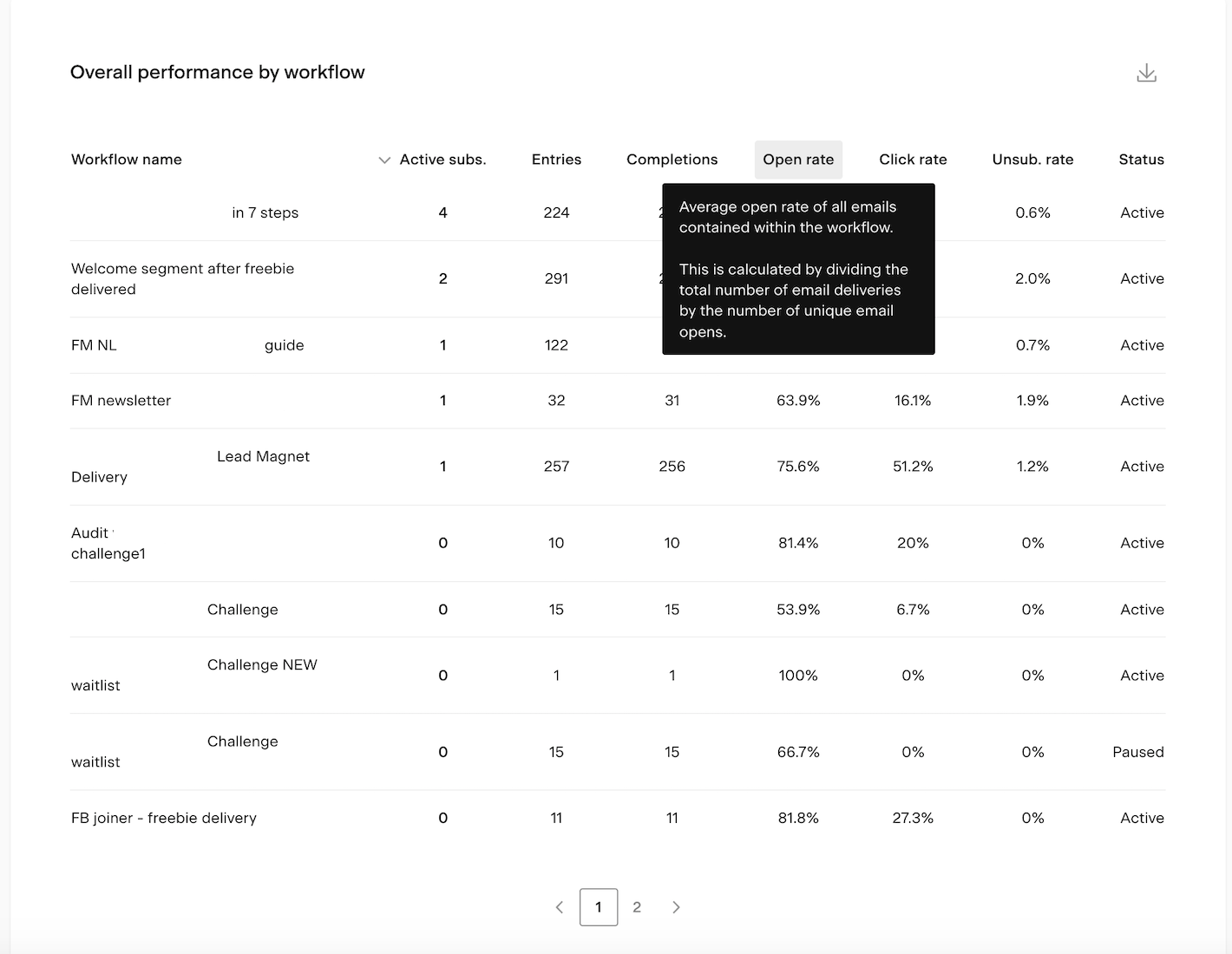
Overall performance by workflow table
You'll find two tables at the bottom of the workflows analytics page.
Use the insights from the Overall performance by workflow table to compare the overall performance of your workflows and discover which workflows drive the most engagement (and which don’t).
Hover over the column title to open a tooltip defining the metric.
Click on any column titles to sort the table based on that specific data set.
The Overall performance by workflow table shows the following data sets:
Workflow name: Title of workflow
Active subscribers: The number of subscribers who are currently in a step of a published workflow.
Entries: Number of times the workflow has been entered by a subscriber
Completions: Number of times the workflow has been completed by a subscriber
Open rate: Average open rate of all emails contained within the workflow. This is calculated by dividing the total number of email deliveries by the number of unique opens.
Click rate: Average click rate of all emails contained within the workflow. This is calculated by dividing the total number of email deliveries by the number of unique email clicks.
Unsubscribe rate: Average unsubscribe rate of all emails contained within the workflow. This is calculated by dividing the total number of email deliveries by the number of unsubscribes.
Status: Workflow status
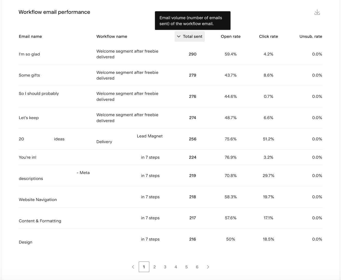
Workflow email performance table
The Workflow email performance table details the overall performance of your workflow emails. It helps you find out which content your subscribers like the most.
Hover over the column title to open a tooltip defining the metric.
Click on any column titles to sort the table based on that specific data set.
Column titles:
Email name: Title of email
Workflow name: Title of workflow
Total sent: Email volume (number of emails sent) of the workflow email.
Open rate: The percentage of unique subscribers who opened the email compared to the total number of subscribers who received the email.
Click rate: The percentage of unique subscribers who clicked on an email link compared to the total number of subscribers who received the email.
Unsubscribe rate: The percentage of unique unsubscribes compared to the total number of subscribers who received the email.
Exporting workflow analytics data
Bar charts, bar chart pop-ups and tables have the ability to export a CSV containing the data of the chart view by clicking the download icon. If you choose to export, you will receive an email with a link to the CSV file.
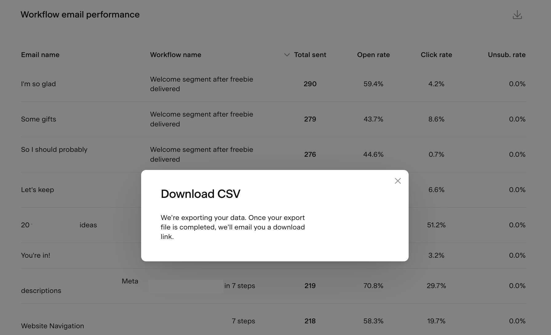
Note: the CSV link in the email expires after 24 hours. You need to generate a new report if you missed accessing and downloading the CSV file within 24 hours.
Summary
To access the account-level workflows analytics dashboard, click the Analytics tab in the top navigation bar, then select the Workflows page view.
Use the insights on this page to see a snapshot of how all your automated emails are performing, how subscribers engage with workflows over time, and which workflow subscribers are unsubscribing from the most.