
Account-level email insights
A quick overview of your account-level email analytics dashboard
Whether you’d like to understand your overall email open rates and click rates or see the performance of your email campaigns side-by-side, we got you covered.
The account-level email analytics dashboard provides powerful insights that you can take action on right away.
In this article, you’ll learn
how to access your account-level emails analytics dashboard,
what type of information you can find on the various chart types, and
how to export the data contained within the current chart views.
Where can I find the Email analytics dashboard?
To access the account-level email analytics dashboard, click the Analytics tab in the top navigation bar, then select the Emails page view.
Important: Drilled-down analytics of a specific email send continue to live within the Emails tab of the top navigation bar.
To see the performance of a particular email campaign or email newsletter you sent, read How can I see how my emails performed?
What kind of data can I find on the Emails analytics dashboard?
Email metric card with edu-carousel
On the top of the Emails analytics page, the Lifetime email metrics card gives you a quick overview of your:
Emails sent: Total count of (non-workflow) email sends. This refers to the unique emails you have scheduled and sent, not the volume of emails sent out from the email send.
Total email volume: Total count of (non-workflow) email volume produced by the email sends.
Deliverability rate: Average deliverability rate across all (non-workflow) email sends.
Open rate: Average open rate across all (non-workflow) email sends.
Click rate: Average click rate across all (non-workflow) email sends.
Unsubscribe rate: Average unsubscribe rate across all (non-workflow) email sends.
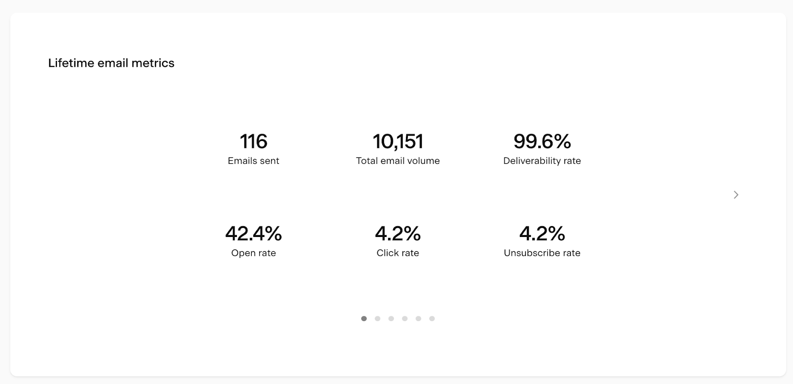
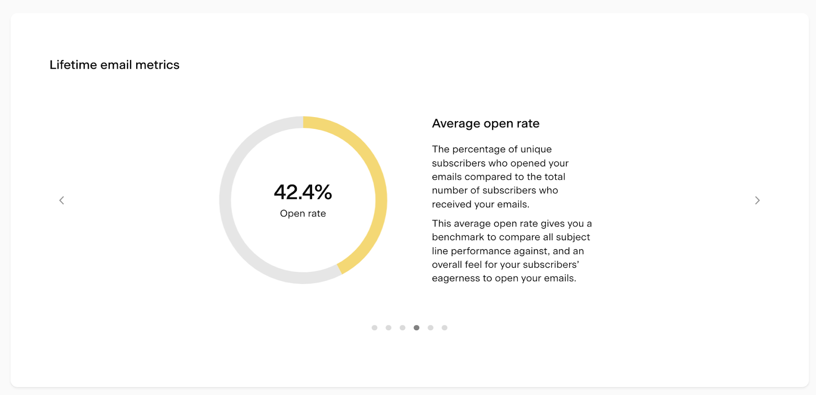
Clicking through the carousel provides more in-depth information about your email metrics.
Email bar chart
The following chart on the page is the Email sending activity bar chart. Use the below controls to fine-tune your data view.
(1) Metric drop-down:
With this drop-down, you can pick the metric (#) that is represented by the bar height of the chart. The scale for this metric is set on the left-side of the chart.
You can select:
Emails sent: Total count of (non-workflow) email sends within the selected time frame.
Total email volume: Total count of (non-workflow) email volume produced by the email sends within the selected time frame.
Opens: Total email opens within the selected timeframe.
Clicks: Total email clicks within the selected timeframe
(2) Time period selector:
Use this to select the time unit the data is viewed by (i.e. Daily or Weekly) as well as the time period of the overall chart (i.e. Last 30 days or 12 weeks).
There are preset chart time periods based on the unit selection and the option to select a custom timeframe.
Daily: 7 days, 14 days, 30 days, Custom
Weekly: 8 weeks, 12 weeks, 24 weeks, Custom
Monthly: 6 months, 12 months, 24 months, Custom
Yearly: All years
Important: all data is displayed based on the timezone you have set in your account settings.
How to use the Email sending activity bar chart?
With the help of this powerful bar chart, you can poke around and see insights for a selected time frame—or even specific days.

When you hover over a bar or section of a bar (when the group-by toggle is turned on), a tooltip details the data contained within that section.
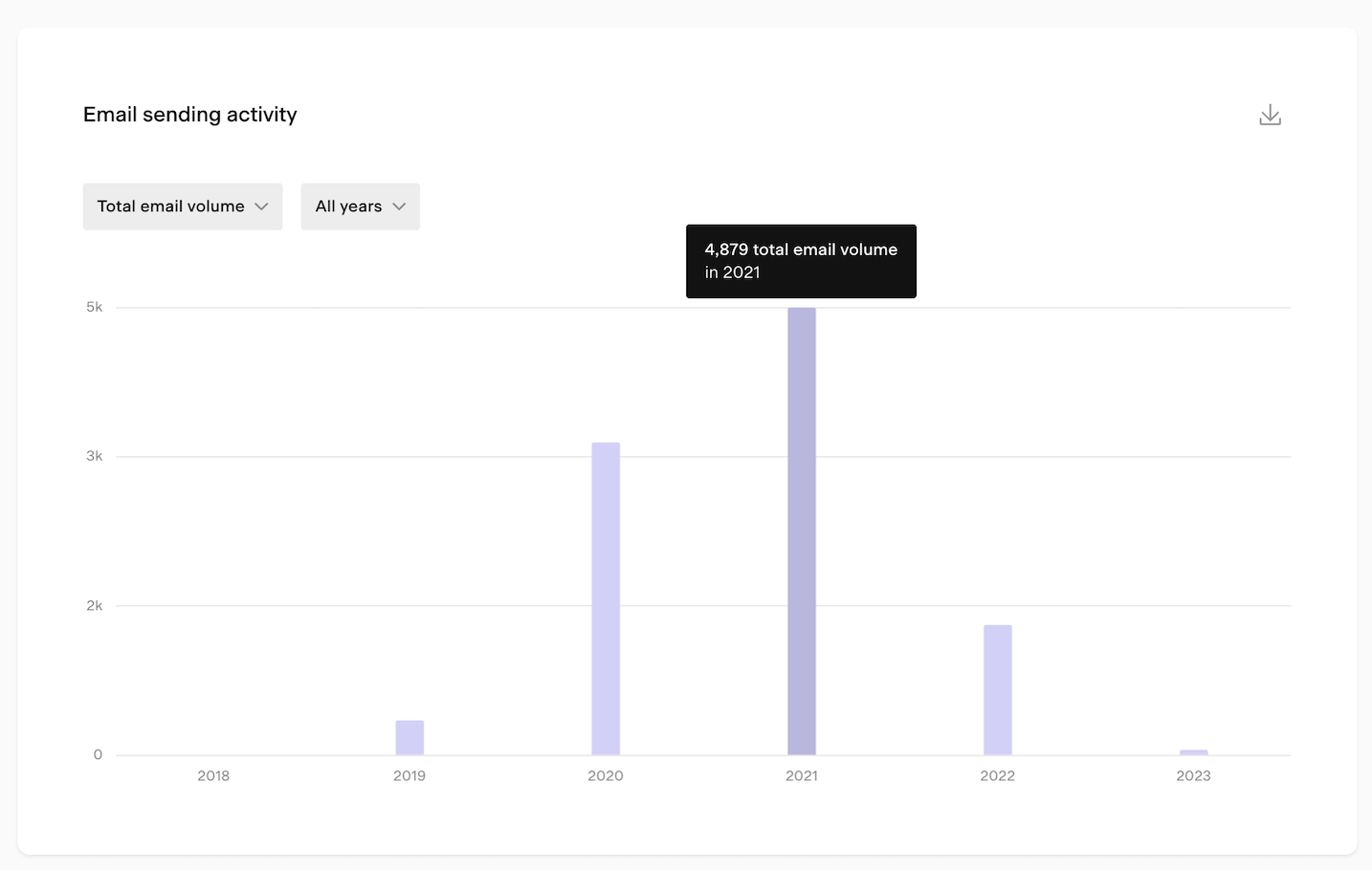
If you click on the same selection, a modal will open that details the data in the selection. You can also export this data view into a CSV file.
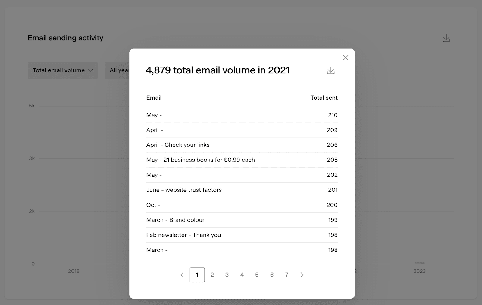
Note: the data set shows the name on the email card, not the email’s subject line.
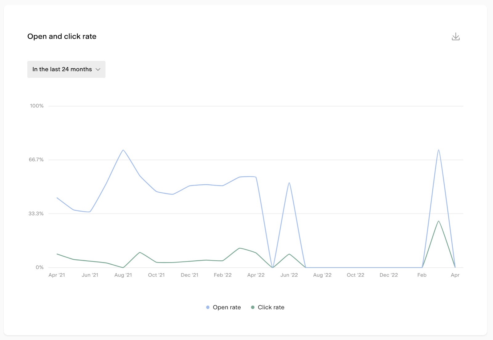
Email Open/Click rate line chart
The following chart on the page is the Open and click rate line chart displaying your email open-and click rates over time.
You can view the data based on the following timeframes:
In the last 12 weeks
In the last 6 months
In the last 12 months
In the last 24 months
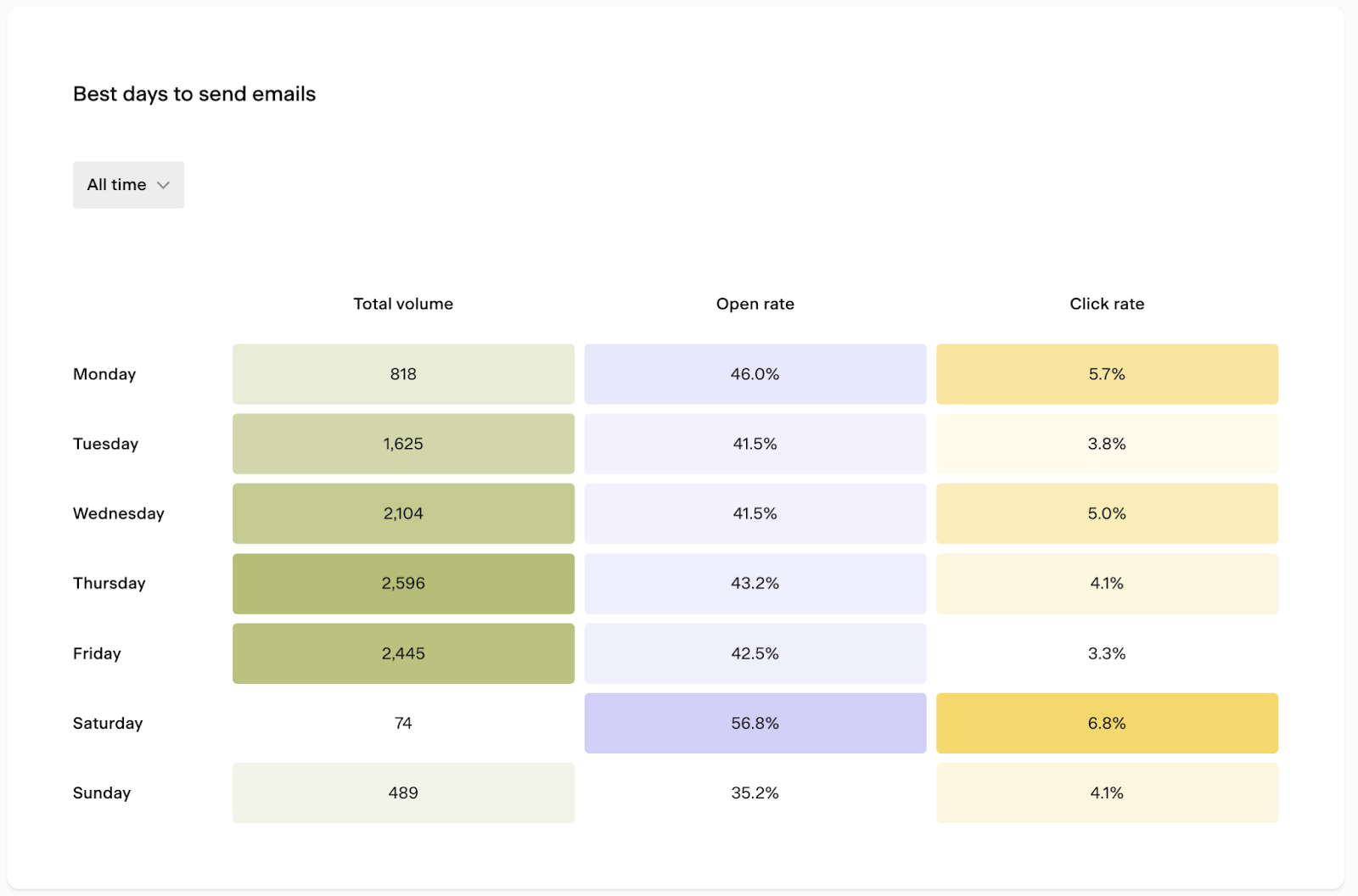
Heat map charts
The Best days to send emails heat map chart analyzes your email sends and shows the total volume of emails sent on each day of the week, plus the open and click rate of the emails sent on that day of the week.
You can pick the following timeframes in the drop-down:
In the last 7 days
In the last 30 days
In the last 90 days
All time
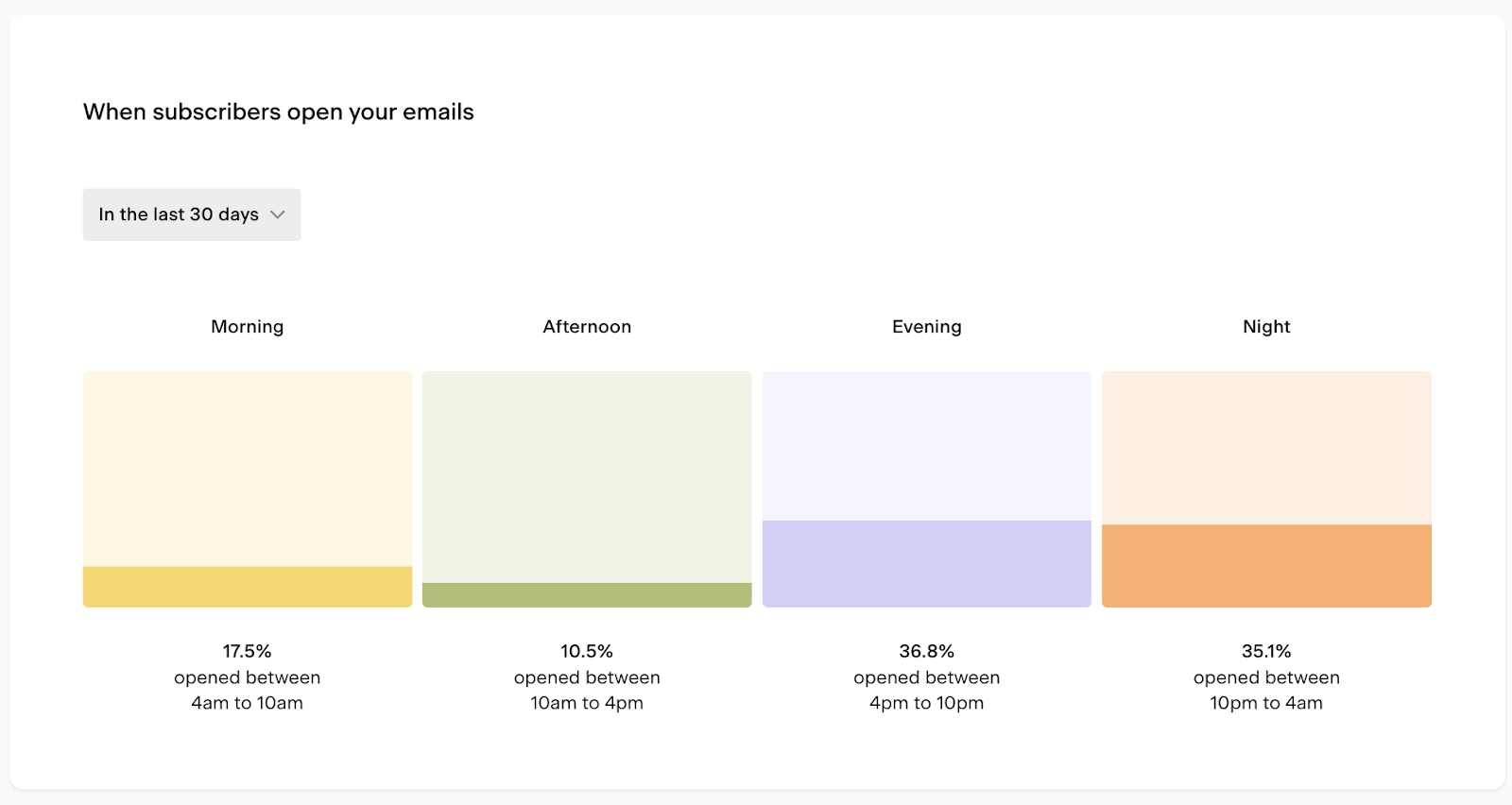
The When subscribers open your emails heat map chart shows what time of day your subscribers are opening your emails.
The chart looks at the timestamp of any email open and categorizes it as morning, afternoon, evening, or night. It then calculates the count of opens at [time of day] / total count of opens.
You can view the data based on the following timeframes::
In the last 7 days
In the last 30 days
In the last 90 days
All time
The Clicks by device type chart breaks down where email clicks are happening. This chart displays the total number of email clicks across all emails and looks at any email click, and categorizes it as desktop or mobile.
You can pick the following timeframes in the drop-down:
In the last 7 days
In the last 30 days
In the last 90 days
All time
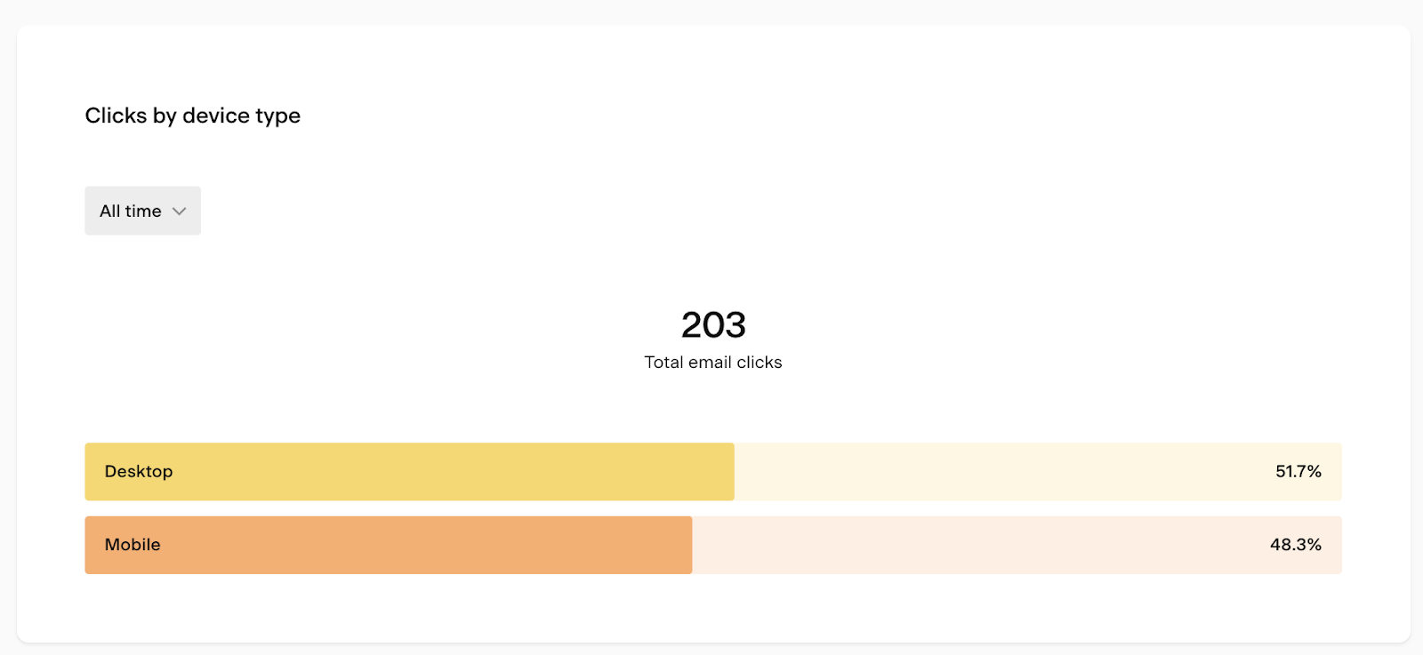
Use the insights from these heat map charts to find the best day and time of day for your next big email campaign send and to design the email based on your subscriber’s device preferences.
Email table
You'll find the Performance by email table at the bottom of the emails analytics page. Use the insights to compare the performance of your past email campaigns and to see which email your subscribers love the most!
Note: Resends are captured as a separate row with their own set of metrics. In this case, you’ll see two rows:
Email title #1
Email title #1 - Resend
Hover over the column title to open a tooltip defining the metric.
Click on any column titles to sort the table based on that specific data set.
The Performance by email table shows the following data sets:
Email name: Email title
Date sent: Date the email was sent
Total sent: Email volume (number of emails sent) of the email send.
Opens: Number of people who opened the email.
Open rate: The percentage of unique subscribers who opened the email. This is calculated by dividing the total number of email deliveries by the number of unique email opens.
Clicks: Number of people who clicked within the email.
Click rate: The percentage of unique subscribers who clicked on an email link compared to the total number of subscribers who received the email.
Unsub. rate: The percentage of unique unsubscribes compared to the total number of subscribers who received the email.
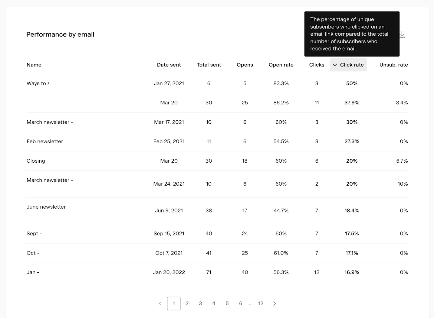
Note: the data set shows the email title (name on card), not the subject line.
Exporting email analytics data
Bar charts, bar chart pop-ups and tables have the ability to export a CSV containing the data of the chart view by clicking the download icon. If you choose to export, you will receive an email with a link to the CSV file.
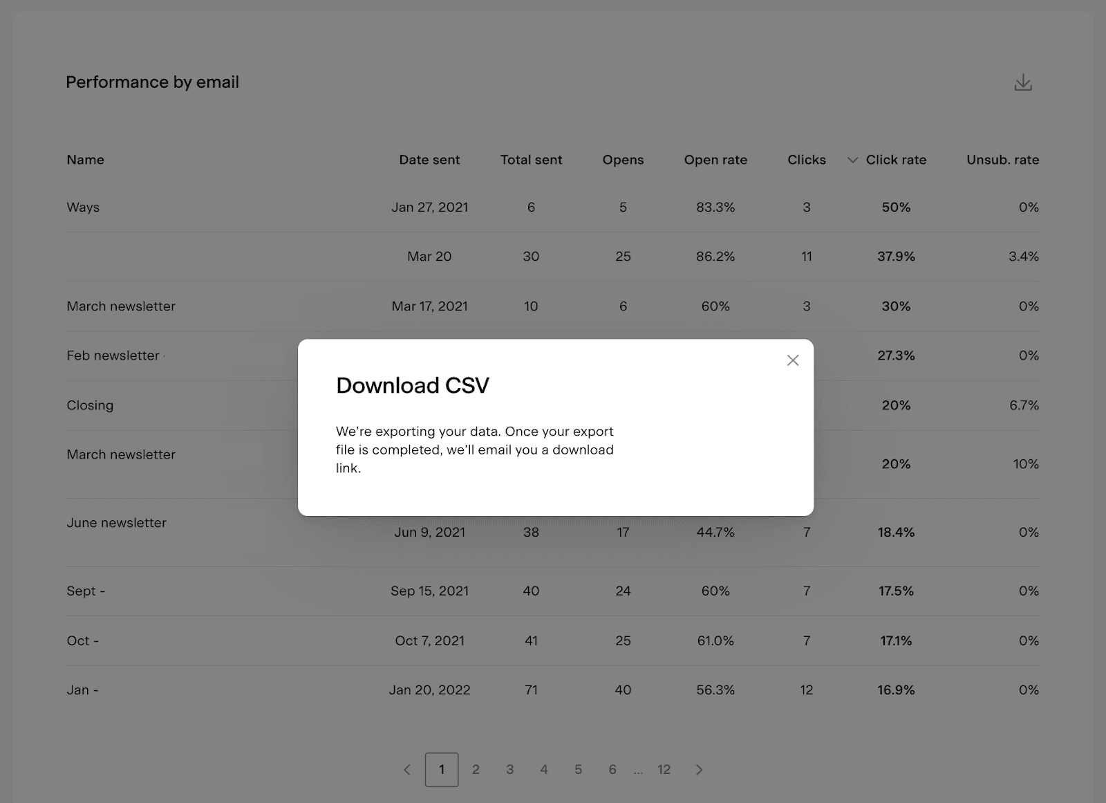
Note: the CSV link in the email expires after 24 hours. You need to generate a new report if you missed accessing and downloading the CSV file within 24 hours.
Summary
To access the account-level email analytics dashboard, click the Analytics tab in the top navigation bar, then select the Emails page view.
Use the insights on this page to see which emails people love the most, how eager people are to open your emails (or not), and which day and time are best for sending.