
Email design best practices for desktop and mobile
Email design plays a big role in how subscribers engage with your emails. Since subscribers read emails on both desktop and mobile devices, designing with device behavior in mind helps improve opens, clicks, and overall readability.
Note: These email design best practices are not unique to Flodesk. They are universal email marketing principles that apply across all email platforms, but understanding why they work helps you customize your emails more effectively.
How to know which devices your subscribers use
Before you design, check how your audience engages.
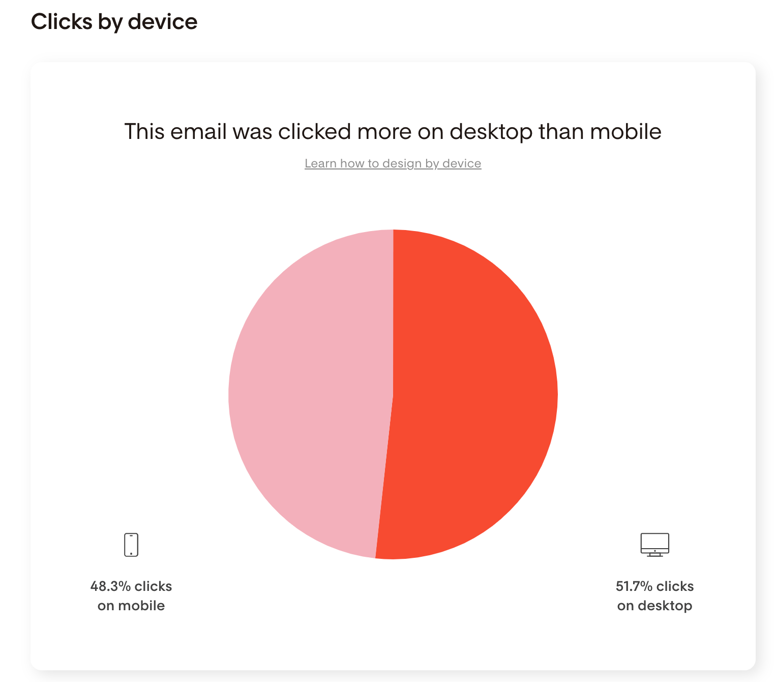
You can see whether your subscribers prefer desktop or mobile by reviewing your email reports:
Available for both standalone emails and workflow emails
Look at click data by device
Use this insight to decide whether to design mobile-first or balance equally between desktop and mobile.
Mobile-first email design best practices
If most of your subscribers read and click emails on their phones, prioritize mobile readability.
Preview your email on your phone
Since emails are built on desktop, always send yourself a test email and view it on your phone.
Ask yourself:
Is the text easy to read?
Are buttons easy to tap?
Does anything feel cramped or overwhelming?
Adjust spacing, font size, or layout as needed.
Keep subject lines and preview text short
Mobile inboxes show fewer characters.
Best practice:
Short, clear subject lines
Preview text that complements (not repeats) the subject line
Always check how both appear in a mobile inbox when reviewing test emails.check your test email on your phone.
Increase font sizes for readability
Small screens make small text harder to read.
Recommended starting points:
Body text: at least 14–16px
Headings: large enough to clearly stand out from body text
Avoid long paragraphs. Shorter text blocks improve scannability on mobile.
Keep key content “above the fold”
“Above the fold” means what’s visible before scrolling.
Place these early in your email:
Main message or value
Primary call-to-action (CTA)
Large images can push important content too far down. Consider placing images after your main CTA.
Email design best practices for both desktop and mobile
These principles apply no matter which device your subscribers prefer.
Keep emails short and focused
Inbox competition is high. Clear, concise emails perform better.
Why this matters:
Long emails feel overwhelming on mobile
Shorter emails load faster
Focused messages increase click-through rates
One email = one main goal. Avoid competing CTAs whenever possible.
Use consistent spacing between blocks
Spacing improves readability and prevents emails from looking cluttered — but it also affects your overall email size.
Best practice:
Keep spacing consistent throughout the email
Always preview spacing on mobile to make sure it doesn't feel too tight or too spread out
Keep an eye on email size. Emails that are too large get clipped by email clients like Gmail, which cuts off your content and hides your unsubscribe link. Where possible, add an extra new line at the end of your plain text blocks to create spacing instead of adding a separate spacer block. This small change can significantly reduce your email size.
Optimize CTA buttons
CTA buttons should be:
Clear
Short
Easy to tap
Examples that work well:
“Buy now”
“Read more”
“Save my spot”
Avoid long CTA text. On mobile, long text can wrap onto multiple lines and make buttons look broken.
Make buttons large enough for thumbs. Small buttons reduce mobile clicks.
Use images intentionally
Images should support your message, not overwhelm it.
Best practices:
Avoid stacking too many large images
Balance images with text
Make sure important information is not only inside an image
Always assume images may load slowly or be blocked. Your email should still make sense without them.
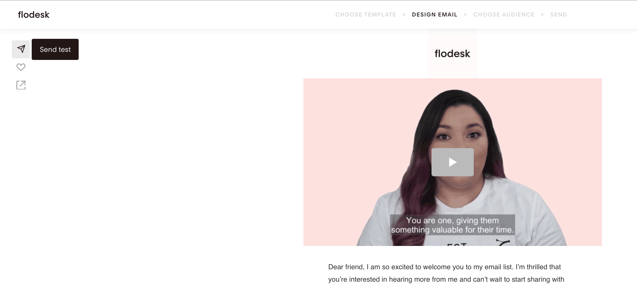
Always send test emails
Use the paper plane icon in the Flodesk Email Builder to send test emails.
Check your email on:
Desktop
Mobile phone
Different inboxes if possible
Flodesk templates are optimized for both devices, but testing is essential after customization.
Summary
To design effective emails for desktop and mobile:
Check your subscriber device preferences in email reports
Design mobile-first if most clicks happen on phones
Keep content short, scannable, and focused
Use clear CTAs and consistent spacing
Always preview and test before sending
FAQ: Email design best practices
Are these email design best practices specific to Flodesk?
No. These are universal email marketing best practices that apply to all email platforms.
Should I always design emails for mobile first?
If most of your subscribers click emails on mobile, yes. If your audience is evenly split, design with both desktop and mobile in mind and always test on both.
What font size should I use for mobile emails?
Body text should generally be at least 14–16px. Headings should be noticeably larger for clear hierarchy and readability.
How long should my emails be?
Shorter emails perform better, especially on mobile. Focus on one main message and one primary CTA whenever possible.
Why do my buttons look broken on mobile?
This usually happens when CTA text is too long and wraps onto multiple lines. Use short, clear button labels.
Do I need to test my emails if I use Flodesk templates?
Yes. Templates are optimized by default, but changes to spacing, text, or images can affect how your email looks on different devices. Always send a test email before publishing.