
Understanding your workflow analytics in Flodesk
Overview
The Workflow analytics dashboard gives you a complete picture of how your automated emails are performing across your entire account. You can see how many subscribers are moving through your workflows, which workflows are driving the most engagement, and which workflow emails are causing the most unsubscribes.
Note: this dashboard shows account-level data across all your workflows. To see detailed analytics for a specific workflow, go to the Workflows tab and open that workflow directly and read How can I see how my workflow performed?
How to access your workflow analytics
In Flodesk, click the Analytics tab in the top navigation bar and select Workflows.
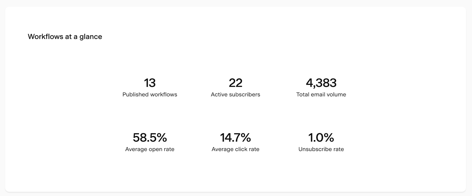
Workflows at a glance
At the top of the page, the Workflows at a glance card gives you an instant snapshot of your workflow performance:
Metric | What it means |
|---|---|
Published workflows | Total number of your currently published workflows |
Active subscribers | Number of subscribers currently moving through a workflow |
Total email volume | Total number of emails sent through all workflows, all time |
Average open rate | Average open rate across all workflow emails |
Average click rate | Average click rate across all workflow emails |
Unsubscribe rate | Average unsubscribe rate across all workflow emails |
Workflow activity chart
The Workflow activity bar chart shows how your workflows have been performing over a selected time period. Use the controls below to customize your view.
Metric dropdown
Choose what the bar height represents:
Metric | What it shows |
|---|---|
Total email volume | Number of workflow emails sent within the selected period |
Subscriber entries | Number of subscribers who entered a workflow within the selected period |
Subscriber completions | Number of subscribers who completed a workflow within the selected period |
Show individual workflows toggle
Turn this on to break the chart down by individual workflow. Each workflow gets its own color in the legend. Turn it off for a combined overview.
Time period selector
Time unit | Available ranges |
|---|---|
Daily | 7 days, 14 days, 30 days, custom |
Weekly | 8 weeks, 12 weeks, 24 weeks, custom |
Monthly | 6 months, 12 months, 24 months, custom |
Yearly | All years |
All data is displayed based on the timezone set in your account settings.
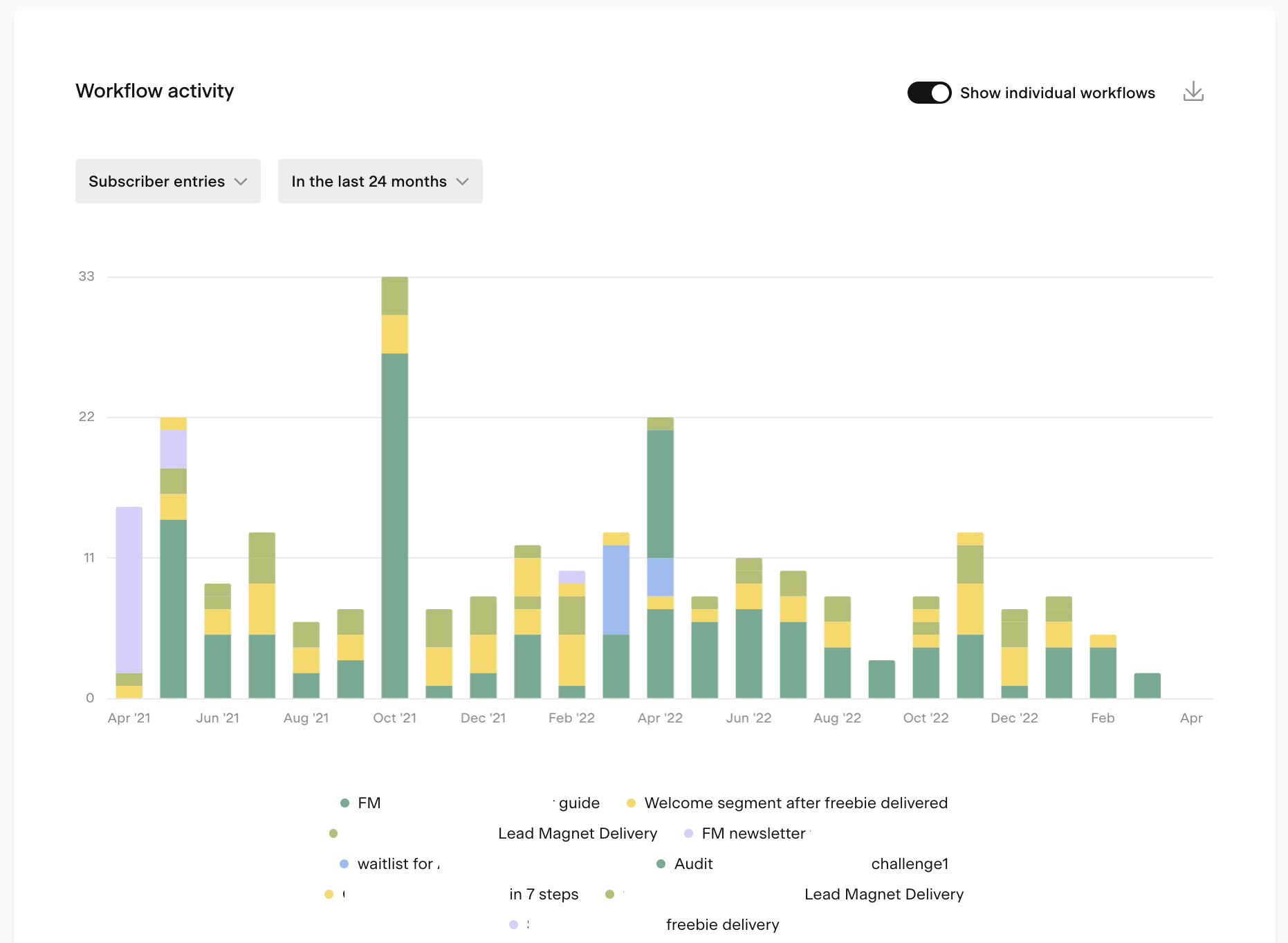
Tips for using the chart:
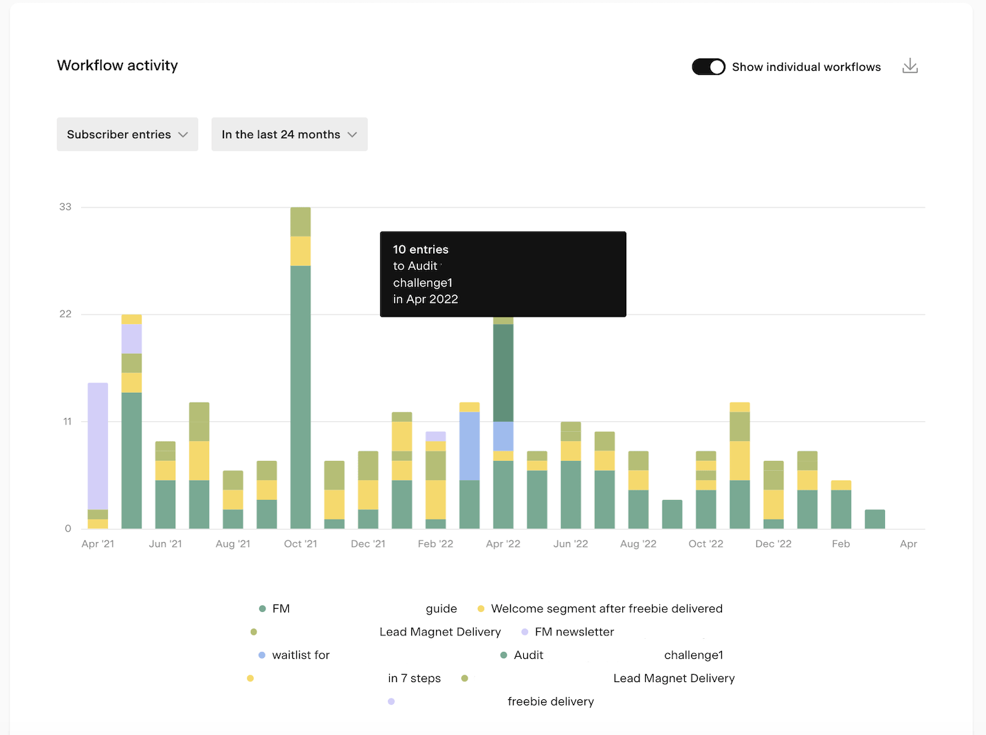
Hover over any bar to see a tooltip with the exact numbers for that period
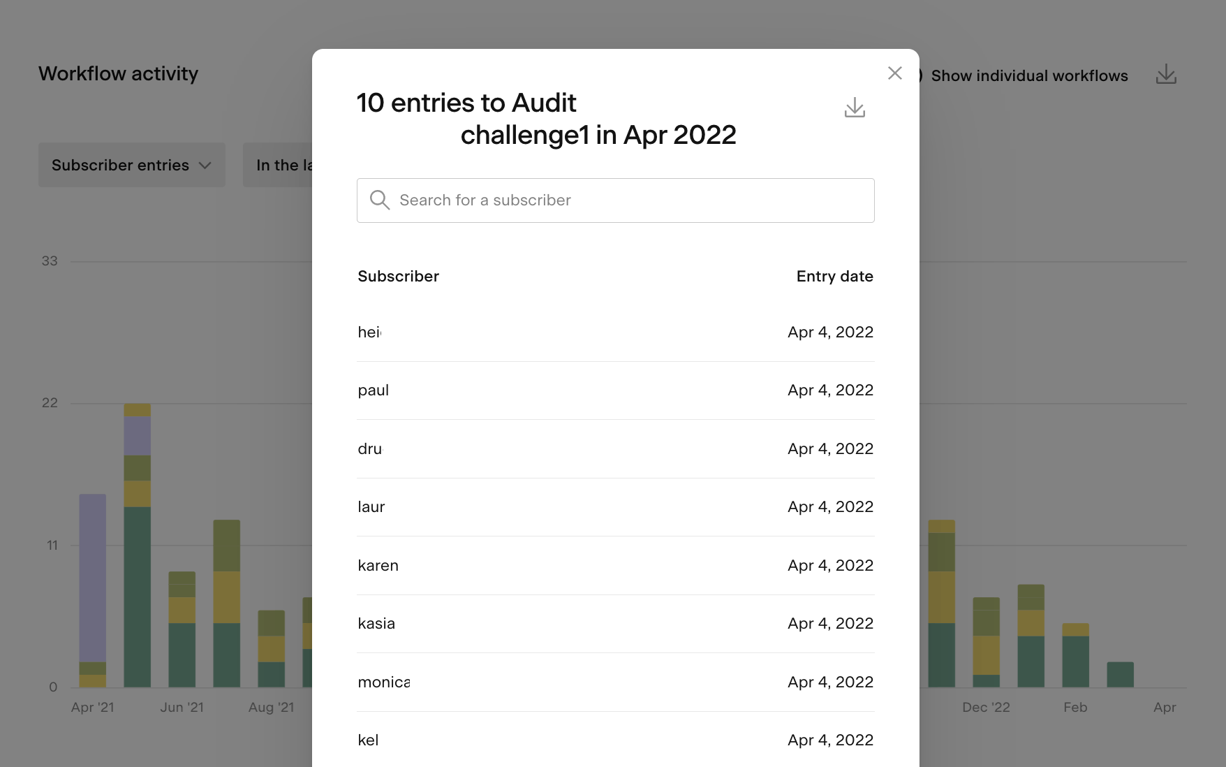
Click on a bar to open a detailed view of that data, which you can also export as a CSV
To focus on a specific workflow, click the other workflow names in the legend to turn them off
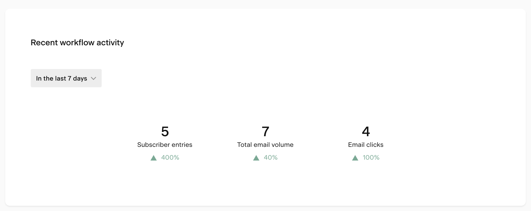
Recent workflow activity chart
The Recent workflow activity chart shows whether your workflow metrics are trending up or down. It compares a selected recent period to the previous equivalent period and shows the percentage change.
You can view the last 7 or last 30 complete days, compared to the 7 or 30 days before that.
Metrics shown:
Metric | What it shows |
|---|---|
Subscriber entries | Count of workflow entries in the selected period |
Total email volume | Count of workflow emails sent in the selected period |
Email clicks | Email clicks across workflow emails in the selected period |
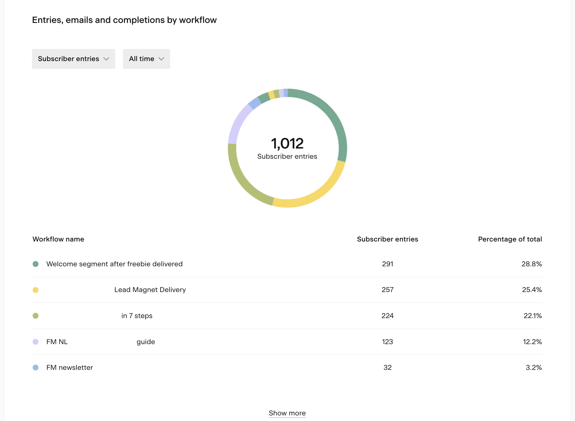
Entries, emails, and completions by workflow chart
The Entries, emails, and completions by workflow pie chart shows how workflow activity is distributed across your individual workflows for a selected time period.
Available timeframes: last 7 days, last 30 days, or all time.
You can switch the metric dropdown to view:
Total email volume: emails sent by each workflow
Subscriber entries: how many subscribers entered each workflow
Subscriber completions: how many subscribers completed each workflow
This is a quick way to see which workflows are driving the most activity at a glance.
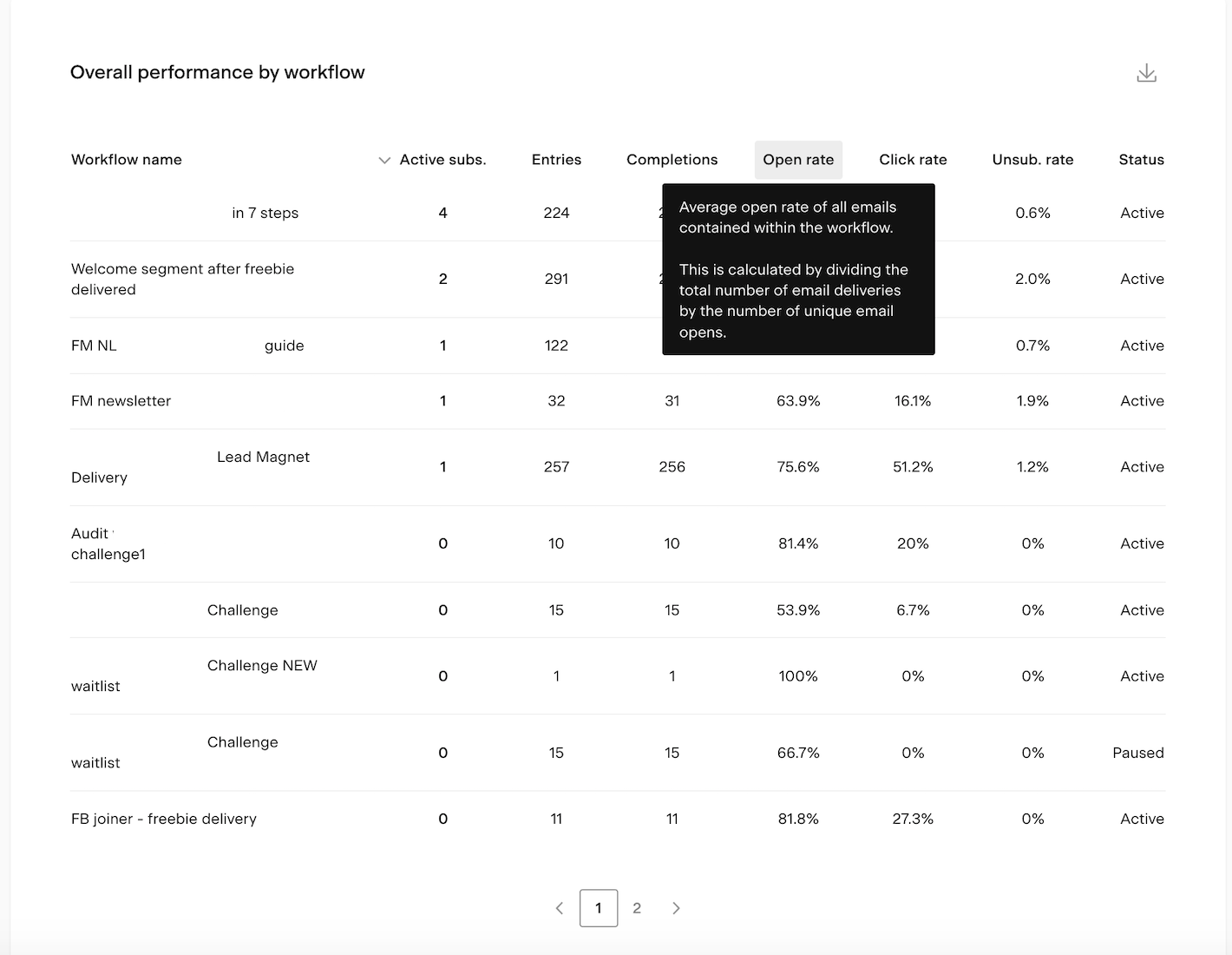
Overall performance by workflow table
The Overall performance by workflow table lets you compare all your workflows side by side. Click any column heading to sort by that metric.
Column | What it shows |
|---|---|
Workflow name | The title of the workflow |
Active subscribers | Subscribers currently in an active step of this workflow |
Entries | Total number of times subscribers have entered this workflow |
Completions | Total number of times subscribers have completed this workflow |
Open rate | Average open rate across all emails in this workflow |
Click rate | Average click rate across all emails in this workflow |
Unsubscribe rate | Average unsubscribe rate across all emails in this workflow |
Status | Whether the workflow is published, paused, or in draft |
Hover over any column heading to see a tooltip explaining that metric.
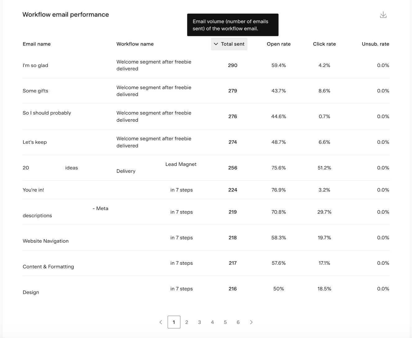
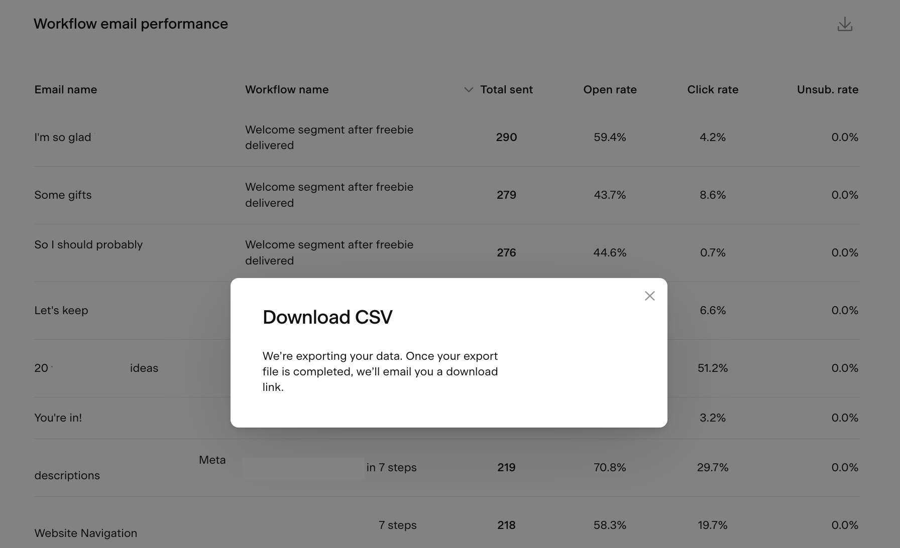
Workflow email performance table
The Workflow email performance table shows individual performance data for each email across all your workflows. Click any column heading to sort by that metric.
Column | What it shows |
|---|---|
Email subject | The subject line of the workflow email |
Workflow name | The workflow the email belongs to |
Total sent | Total number of times this email has been delivered |
Open rate | Percentage of unique subscribers who opened this email |
Click rate | Percentage of unique subscribers who clicked a link in this email |
Unsubscribe rate | Percentage of unique unsubscribes after receiving this email |
Use this table to spot which workflow emails are performing well and which ones may need attention. Sorting by unsubscribe rate is a quick way to find emails that are causing the most drop-off.
How to export workflow analytics data
You can export data from the bar charts, chart pop-ups, and both tables as a CSV file. Click the download icon on any of these elements to request an export. You'll receive an email with a link to download the file.
Note: the download link expires after 24 hours. If you miss the window, you'll need to generate a new export.
FAQ
Where do I find my workflow analytics in Flodesk?
Click the Analytics tab in the top navigation bar and select Workflows. This dashboard shows account-level analytics across all your workflows.
How do I see analytics for a specific workflow?
The account-level dashboard shows data across all workflows combined. To see detailed analytics for a specific workflow, go to the Workflows tab in Flodesk and open that workflow directly and read How can I see how my workflow performed?
What's the difference between "subscriber entries" and "subscriber completions"?
Entries is the number of times subscribers have started a workflow. Completions is the number of times subscribers have finished all the steps. The difference between the two can help you see how many subscribers are dropping off before completing the sequence.
How do I find which workflow has the highest unsubscribe rate?
Go to the Overall performance by workflow table on the Analytics > Workflows page and click the Unsubscribe rate column heading to sort the table from highest to lowest.
How do I find which workflow email is causing the most unsubscribes?
Go to the Workflow email performance table and click the Unsub. rate column heading to sort by unsubscribe rate. The emails at the top are the ones causing the most drop-off.
How do I compare individual workflow performance side by side?
Use the Overall performance by workflow table at the bottom of the Analytics > Workflows page. You can sort by any column, including open rate, click rate, entries, completions, and unsubscribe rate, to compare your workflows directly.
Can I see workflow activity for a specific workflow in the bar chart?
Yes. Turn on the Show individual workflows toggle in the Workflow activity chart. Then click the other workflow names in the legend to turn them off, leaving only the workflow you want to focus on.
Can I export my workflow analytics data?
Yes. Click the download icon on any chart or table to export a CSV file. You'll receive an email with a download link. Note that the link expires after 24 hours, so download the file promptly.
What time zone is my workflow analytics data based on?
All data is displayed based on the timezone set in your Flodesk account settings.