
Understanding your email analytics in Flodesk
Overview
The Email analytics dashboard gives you a complete picture of how your emails are performing across your entire account. You can see your overall open and click rates, track sending activity over time, find the best days and times to send, and compare individual email campaigns side by side.
Note: this dashboard covers your regular (non-workflow) email sends. For analytics on a specific email send, read How can I see how my emails performed? For workflow email analytics, go to Analytics > Workflows.
How to access your email analytics
In Flodesk, click the Analytics tab in the top navigation bar and select Emails.
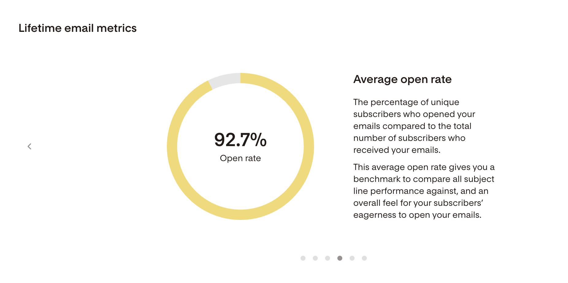
Lifetime email metrics
At the top of the page, the Lifetime email metrics card shows your overall performance across all non-workflow email sends:
Metric | What it means |
|---|---|
Emails sent | Total number of unique email sends (not the total volume of individual emails delivered) |
Total email volume | Total number of individual emails delivered across all your sends |
Delivery rate | Average percentage of emails that reached subscribers' inboxes without bouncing |
Open rate | Average percentage of subscribers who opened your emails |
Click rate | Average percentage of subscribers who clicked a link in your emails |
Unsubscribe rate | Average percentage of subscribers who unsubscribed after receiving your emails |
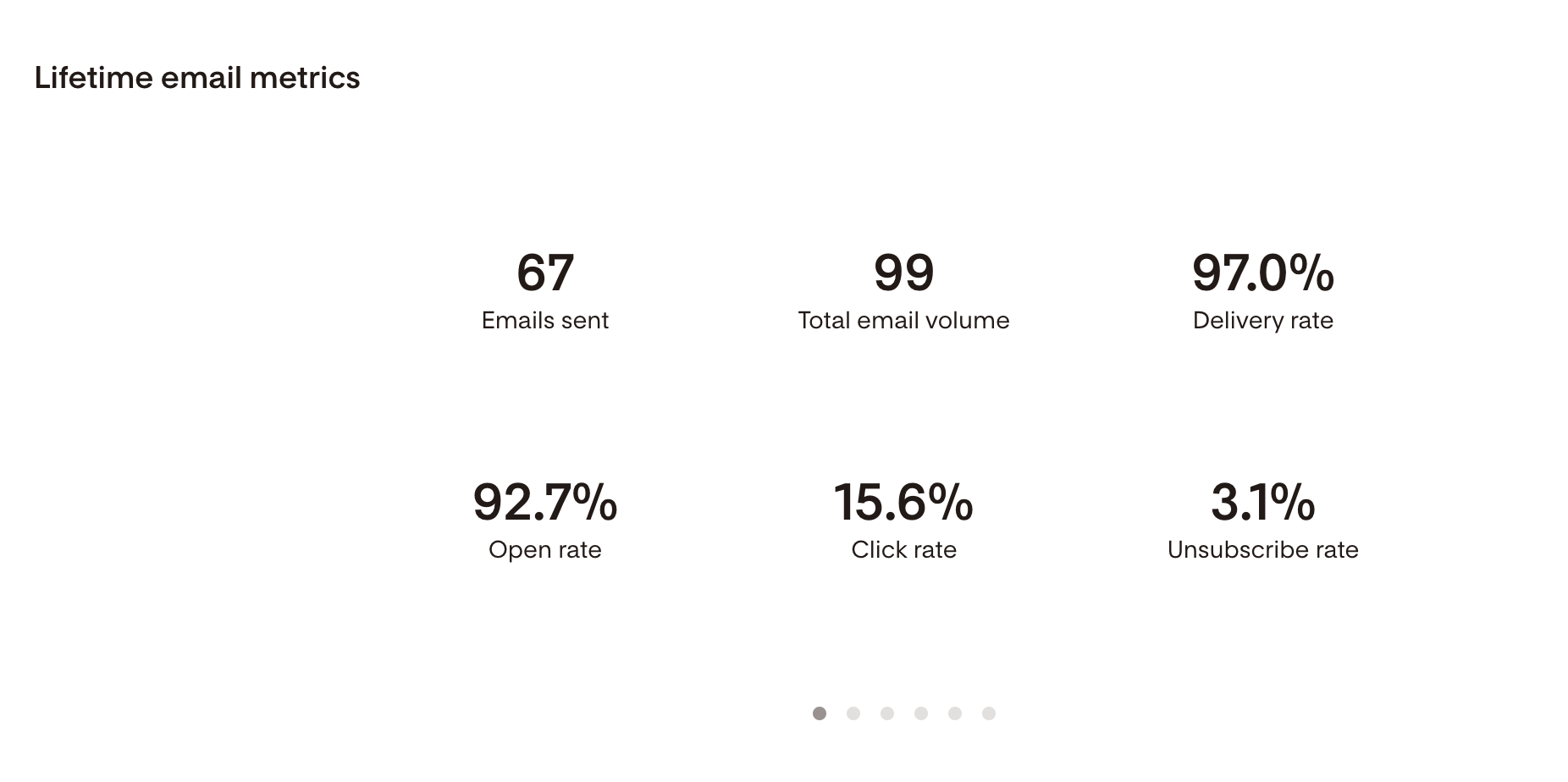
Click through the carousel on this card for more detail on each metric.
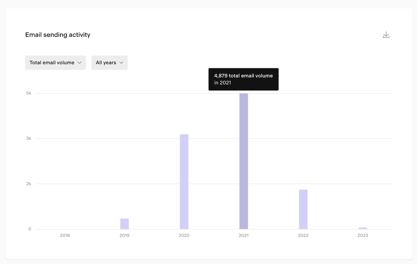
Email sending activity chart
The Email sending activity bar chart shows your email activity over a selected time period. Use the controls below to customize your view.
Metric dropdown
Choose what the bar height represents:
Metric | What it shows |
|---|---|
Emails sent | Total unique email sends within the selected period |
Total email volume | Total individual emails delivered within the selected period |
Opens | Total email opens within the selected period |
Clicks | Total email clicks within the selected period |
Time period selector
Time unit | Available ranges |
|---|---|
Daily | 7 days, 14 days, 30 days, custom |
Weekly | 8 weeks, 12 weeks, 24 weeks, custom |
Monthly | 6 months, 12 months, 24 months, custom |
Yearly | All years |
All data is displayed based on the timezone set in your account settings.
Tips for using the chart:
Hover over any bar to see a tooltip with the exact numbers for that period
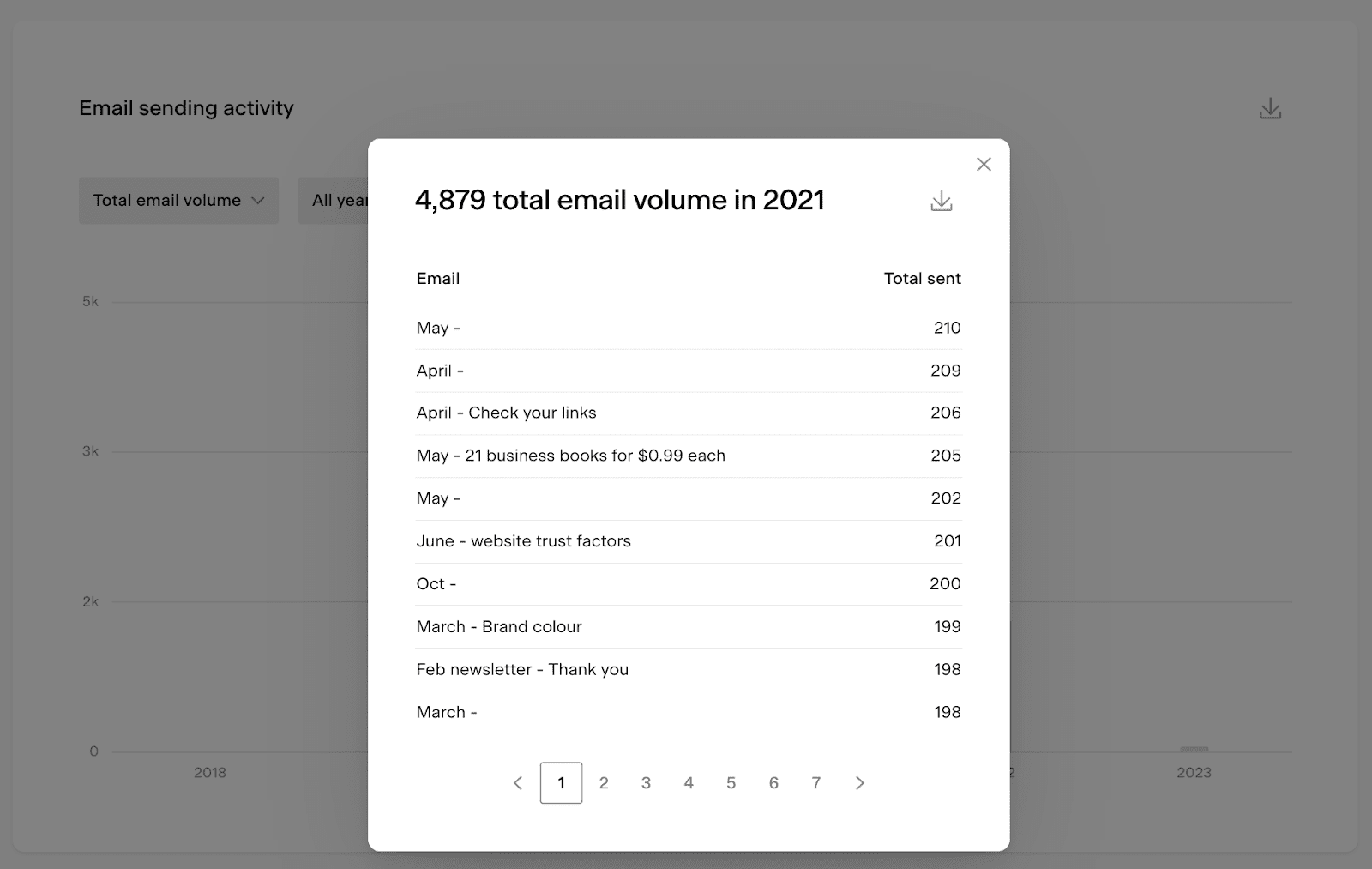
Click on a bar to open a detailed view of that data, which you can also export as a CSV
Note: the chart shows the email card name, not the subject line

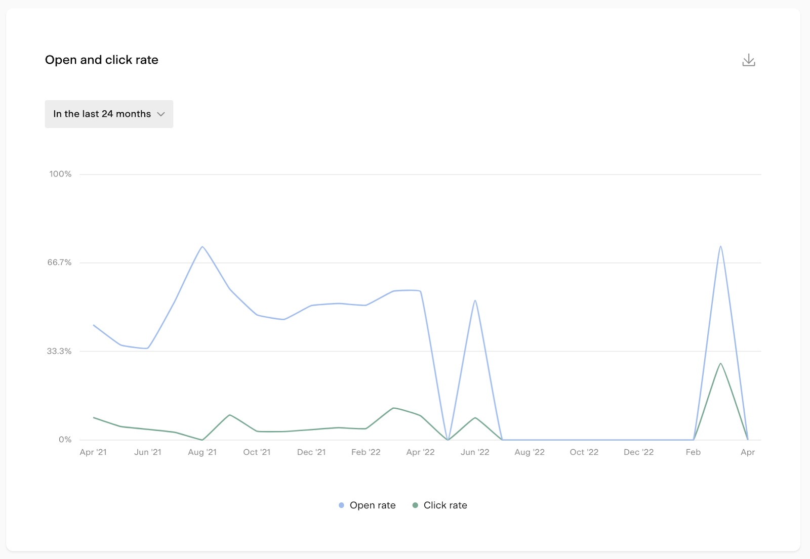
Open and click rate chart
The Open and click rate line chart shows how your open and click rates have trended over time. This is useful for spotting whether engagement is improving, declining, or staying consistent.
Available timeframes: last 12 weeks, last 6 months, last 12 months, or last 24 months.
Heat map charts
Flodesk includes three heat map charts that help you understand when and how subscribers engage with your emails.
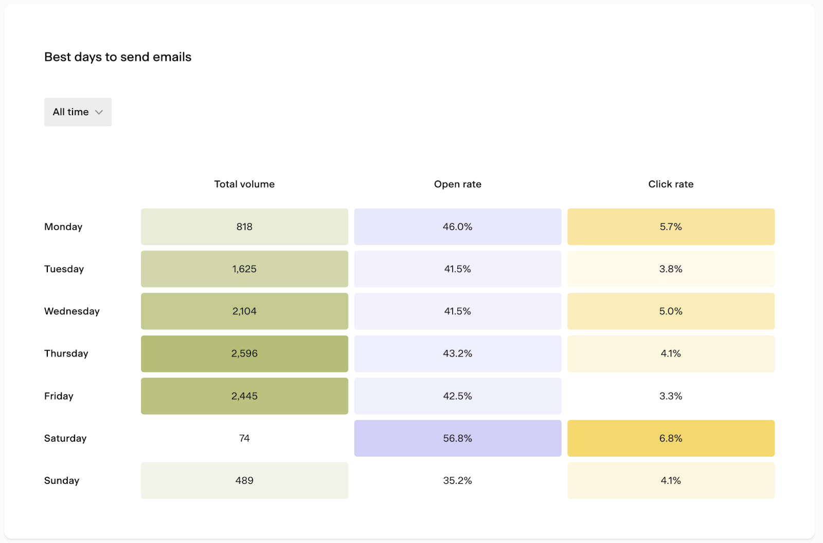
Best days to send emails
This chart shows the total volume of emails sent on each day of the week, along with the open and click rates for emails sent on each day. Use it to identify which days tend to drive the best engagement for your audience.
Available timeframes: last 7 days, last 30 days, last 90 days, or all time.
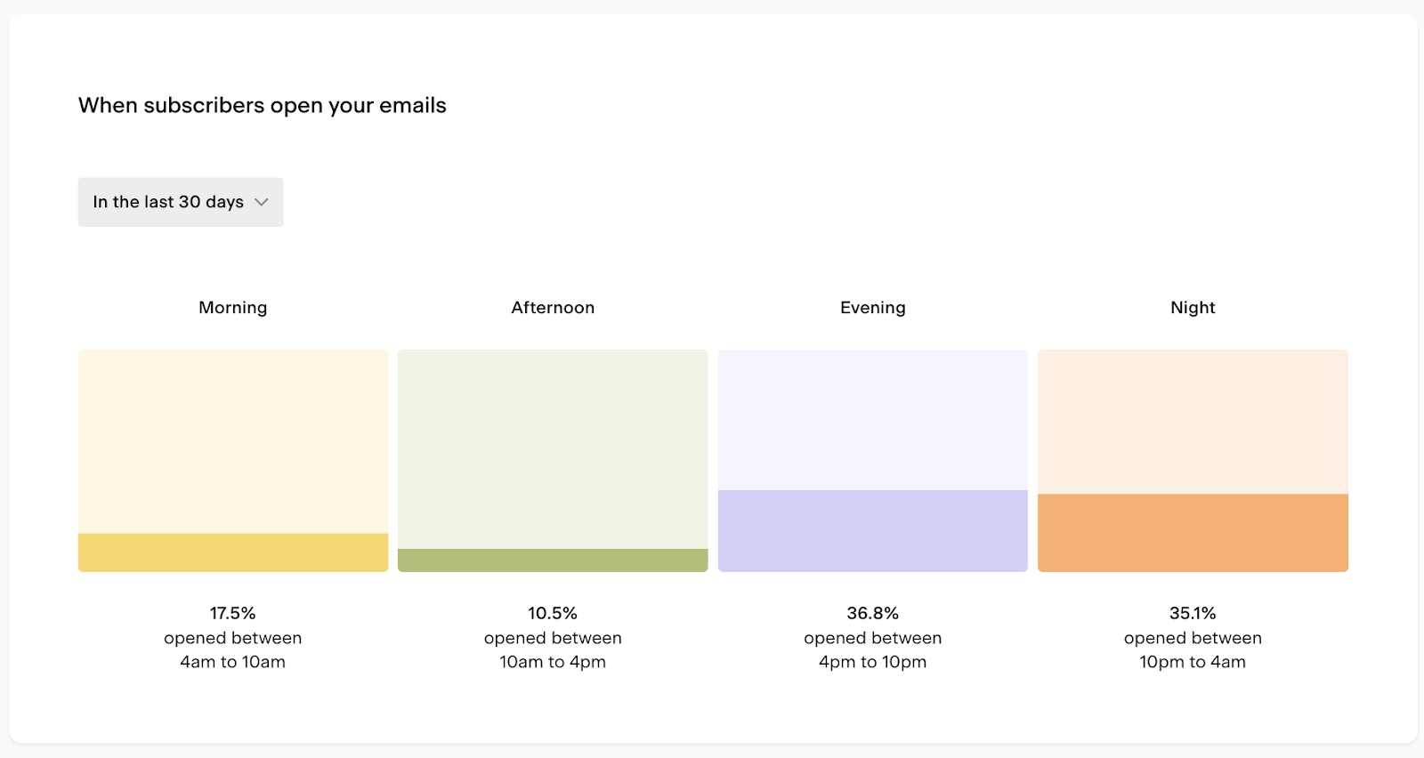
When subscribers open your emails
This chart shows what time of day your subscribers are opening your emails, broken into morning, afternoon, evening, and night. It's calculated as the count of opens at each time of day divided by the total count of opens.
Available timeframes: last 7 days, last 30 days, last 90 days, or all time.
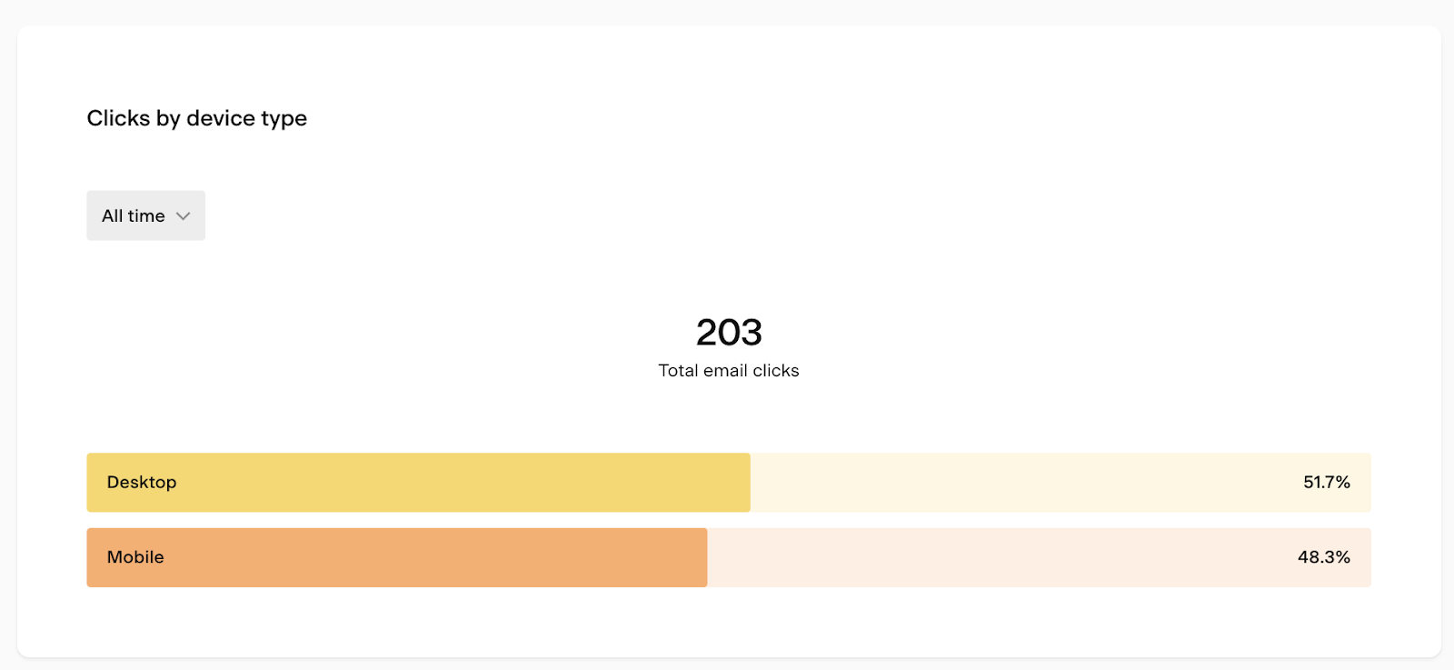
Clicks by device type
This chart shows whether subscribers are clicking your emails on desktop or mobile. Use it to make sure your email designs are optimized for the devices your audience actually uses.
Available timeframes: last 7 days, last 30 days, last 90 days, or all time.
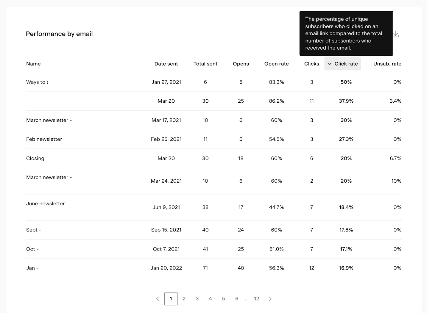
Performance by email table
The Performance by email table at the bottom of the page lets you compare all your past email sends side by side. Click any column heading to sort by that metric.
Column | What it shows |
|---|---|
Email name | The email card title (not the subject line) |
Date sent | When the email was sent |
Total sent | Total number of individual emails delivered for this send |
Opens | Number of subscribers who opened the email |
Open rate | Percentage of unique opens compared to total deliveries |
Clicks | Number of subscribers who clicked a link in the email |
Click rate | Percentage of unique clicks compared to total deliveries |
Unsub. rate | Percentage of unique unsubscribes compared to total deliveries |
Note: if you resent an email to unopens, the resend appears as a separate row with its own metrics, labeled as "Email title - Resend."
Hover over any column heading to see a tooltip explaining that metric.
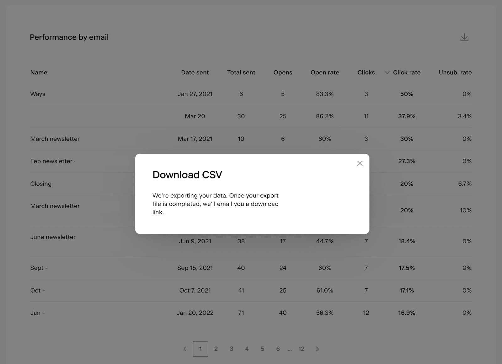
How to export email analytics data
You can export data from the bar charts, chart pop-ups, and the Performance by email table as a CSV file. Click the download icon on any of these elements to request an export. You'll receive an email with a link to download the file.
Note: the download link expires after 24 hours. If you miss the window, you'll need to generate a new export.
FAQ
Where do I find my email analytics in Flodesk?
Click the Analytics tab in the top navigation bar and select Emails. This dashboard shows account-level analytics for all your non-workflow email sends.
What's the difference between "emails sent" and "total email volume"?
Emails sent is the number of unique email sends you've scheduled and sent (for example, three separate campaigns = 3). Total email volume is the total number of individual emails delivered across all those sends (for example, if each campaign went to 500 subscribers, that's 1,500).
Does the Email analytics dashboard include workflow emails?
No. This dashboard covers regular, non-workflow email sends only. For workflow email analytics, go to Analytics > Workflows.
How do I see analytics for a specific email I sent?
Go to the Emails tab in the top navigation bar and open the specific email. Detailed analytics for individual sends live there, not on the account-level dashboard.
How do I find the best day and time to send my emails?
Use the Best days to send emails heat map chart and the When subscribers open your emails heat map chart on the Analytics > Emails page. Both charts let you filter by timeframe so you can see patterns specific to your audience.
How do I know if I should optimize my emails for desktop or mobile?
Check the Clicks by device type chart on the Analytics > Emails page. It shows the split between desktop and mobile clicks so you can prioritize the experience for the device your subscribers use most.
Why does my resent email appear as a separate row in the Performance by email table?
When you resend an email to subscribers who didn't open the original, Flodesk tracks the resend separately so you can compare performance between the two sends. It appears in the table as "Email title - Resend" with its own set of metrics.
Can I export my email analytics data?
Yes. Click the download icon on any chart or the Performance by email table to export a CSV file. You'll receive an email with a download link. The link expires after 24 hours, so download the file promptly.
What time zone is my email analytics data based on?
All data is displayed based on the timezone set in your Flodesk account settings.
Why does the Performance by email table show the email card name instead of the subject line?
The table uses the name you gave the email card in Flodesk, not the subject line the subscriber sees. This helps you identify emails in your dashboard even if you reuse subject lines across multiple sends.