
Understanding your subscriber analytics in Flodesk
Overview
The Subscribers analytics dashboard gives you a complete picture of how your list is growing, where your subscribers are coming from, and how engaged they are. You can track trends over time, compare recent activity to previous periods, and identify your most active subscribers, all in one place.
How to access your subscriber analytics
In Flodesk, go to Analytics > Subscribers.
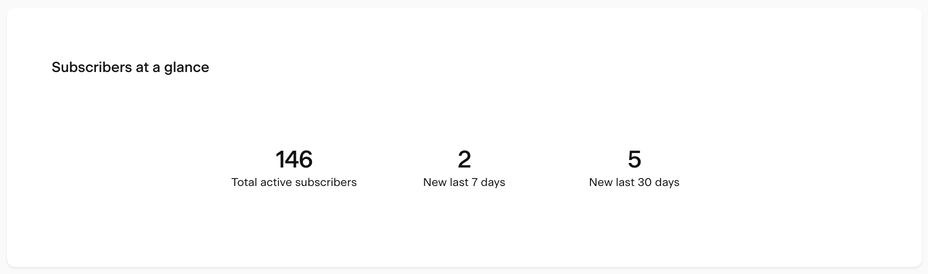
Subscribers at a glance
At the top of the page, the Subscribers at a glance card gives you an instant snapshot of your list:
Metric | What it means |
|---|---|
Total active subscribers | Your current total of active subscribers |
New subscribers in the last 7 days | How many new subscribers joined in the past week |
New subscribers in the last 30 days | How many new subscribers joined in the past month |
Note: active subscribers are those who haven't unsubscribed, bounced, or marked your email as spam. Only active subscribers are eligible to receive your emails.
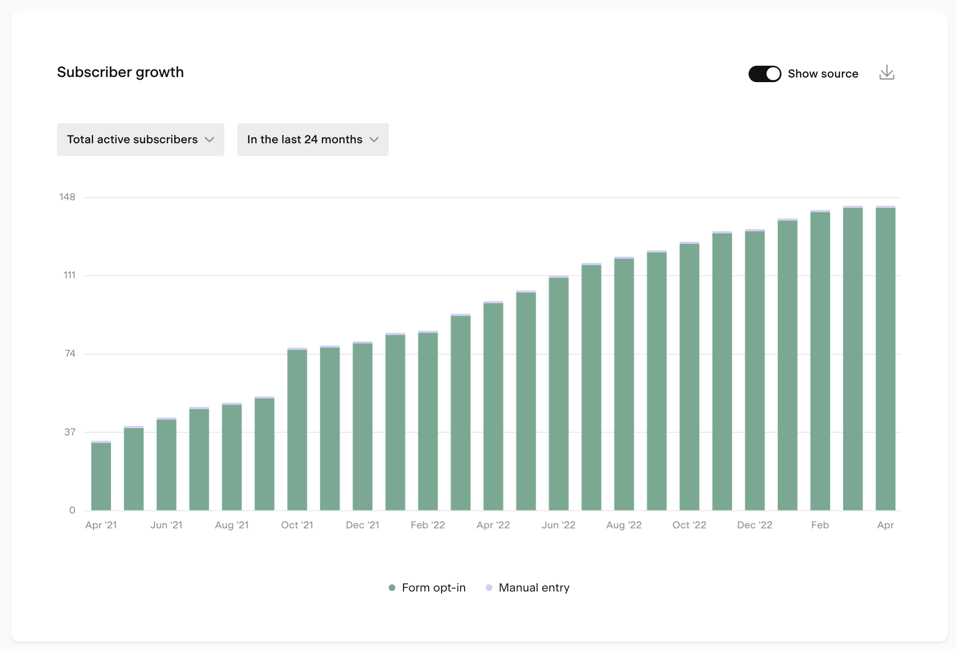
Subscriber growth chart
The Subscriber growth bar chart shows how your list is changing over time. Use the controls below to customize your view.
Metric dropdown
Choose what the bar height represents:
Metric | What it shows |
|---|---|
New subscribers | Subscribers whose join date falls within the selected period |
Total active subscribers | Running total of active subscribers for the selected period |
Unsubscribes | Subscribers whose unsubscribe date falls within the selected period |
For example, if you had 300 active subscribers last week and gained 50 this week, New subscribers this week would be 50, and Total active subscribers for this week would be 350.
Show source toggle
Turn this on to break the chart down by how subscribers joined your list:
Source | What it means |
|---|---|
Form opt-in | Joined through a Flodesk opt-in form |
Checkout customer | Added as a buyer through Flodesk Checkout |
CSV upload | Imported via a CSV file |
Manual entry | Added manually or via Zapier or Pabbly Connect |
Integration | Added through a direct integration |
Time period selector
Choose the time unit and range for the chart:
Time unit | Available ranges |
|---|---|
Daily | 7 days, 14 days, 30 days, custom |
Weekly | 8 weeks, 12 weeks, 24 weeks, custom |
Monthly | 6 months, 12 months, 24 months, custom |
Yearly | All years |
All data is displayed based on the timezone set in your account settings.
Tips for using the chart:
Hover over any bar to see a tooltip with the exact numbers for that period
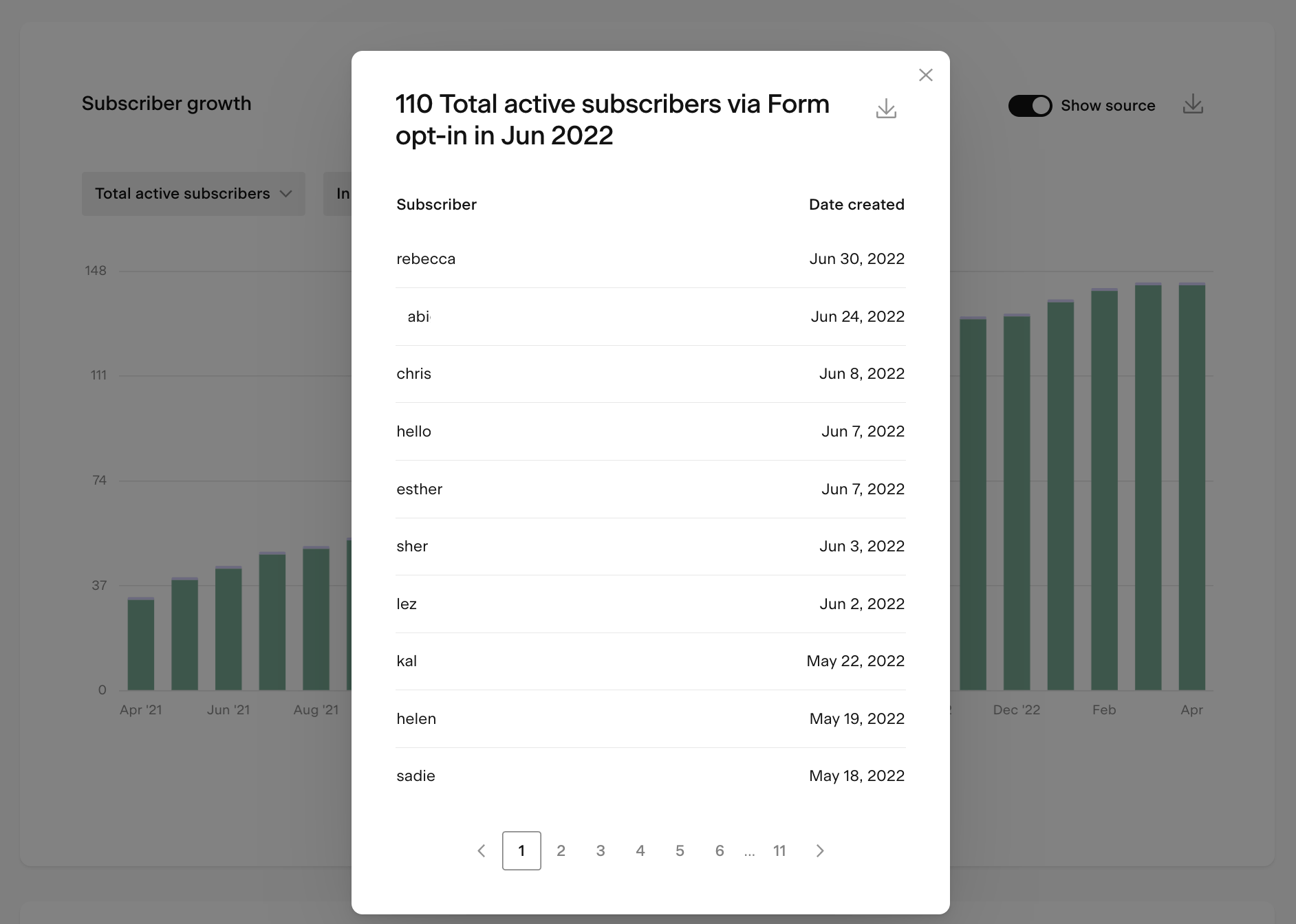
Click on a bar to open a detailed view of that data, which you can also export as a CSV
If your list growth is slowing, consider refreshing your opt-in form offer, promoting it more widely, or checking that your form is placed in the right spots on your website
Keep an eye out for unexpected spikes or drops and investigate what caused them
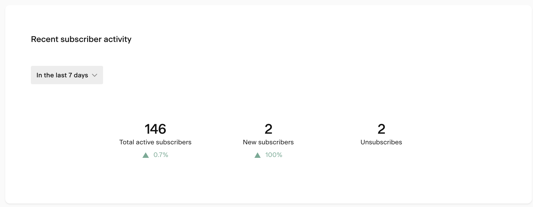
Recent subscriber activity chart
The Recent subscriber activity chart shows whether your key subscriber metrics are trending up or down. It compares a selected recent period to the previous equivalent period and shows the percentage change.
You can view the last 7 or last 30 complete days, compared to the 7 or 30 days before that.
Metrics shown:
Metric | What it shows |
|---|---|
Total active subscribers | Running total of your list size compared to the previous period |
New subscribers | Count of new subscribers in the selected period |
Unsubscribes | Count of unsubscribes in the selected period |
If new subscriber growth is declining, check the Forms analytics page to see how your opt-in forms are performing. If unsubscribes are high, review your Emails and Workflow analytics to understand where and why subscribers are dropping off.
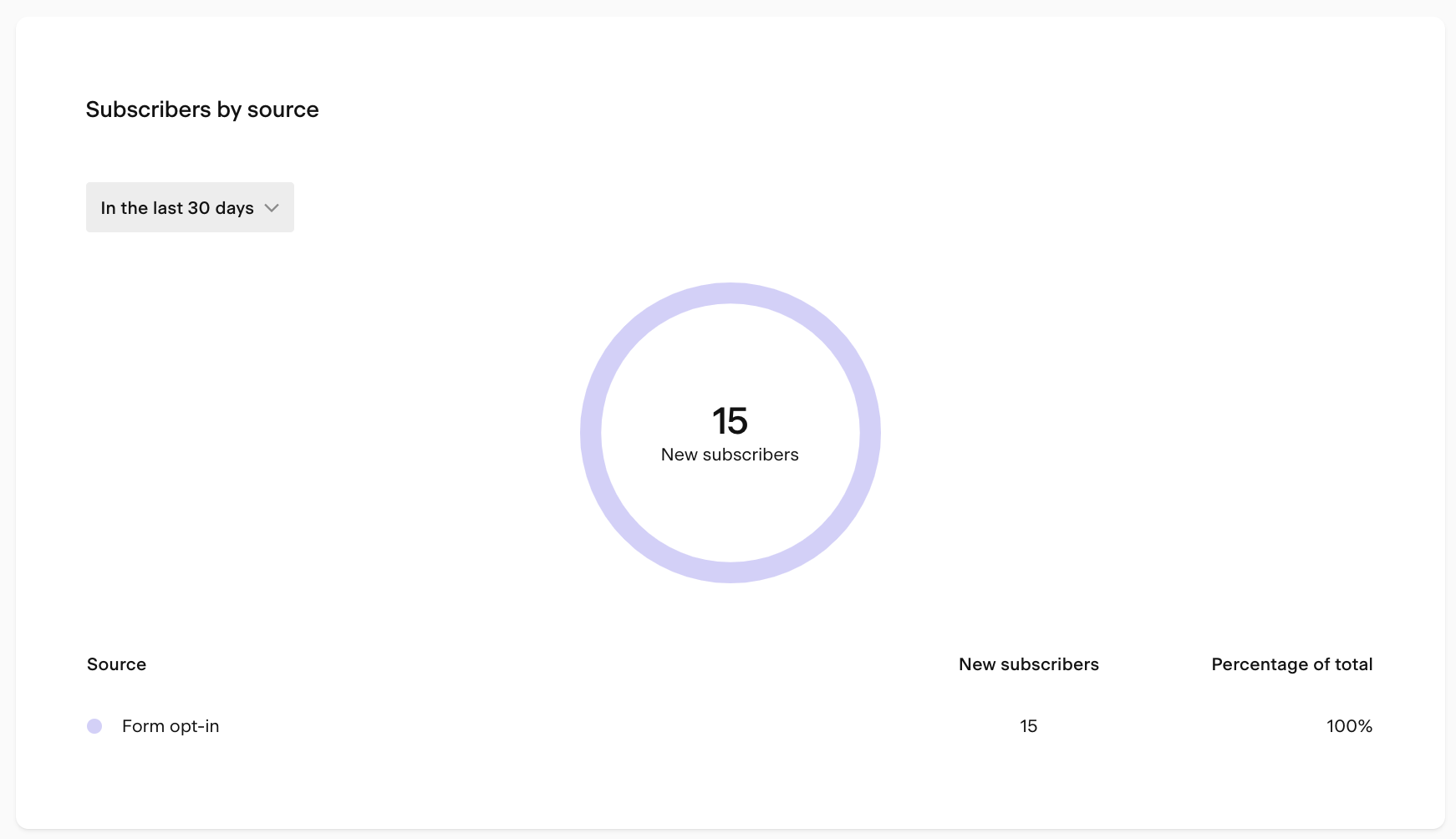
Subscribers by source chart
The Subscribers by source pie chart shows how new subscribers joined your list during a selected time period, broken down by source.
Available timeframes: last 7 days, last 30 days, or all time.
Sources include form opt-ins, Checkout customers, CSV uploads, manual entry, and integrations. Use this chart to see which channels are driving the most growth so you can focus your efforts where they're working best.
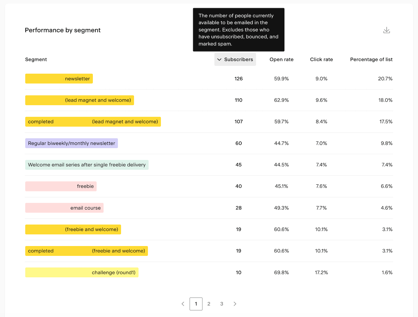
Performance by segment table
The Performance by segment table shows how each of your segments is performing. Click any column heading to sort by that metric.
Column | What it shows |
|---|---|
Active subscribers | Active subscribers in the segment (excludes unsubscribes, bounces, and spam reports) |
Open rate | Percentage of unique opens compared to total deliveries for that segment |
Click rate | Percentage of unique clicks compared to total deliveries for that segment |
Percentage of list | This segment's share of your total active subscribers |
Hover over any column heading to see a tooltip explaining that metric.
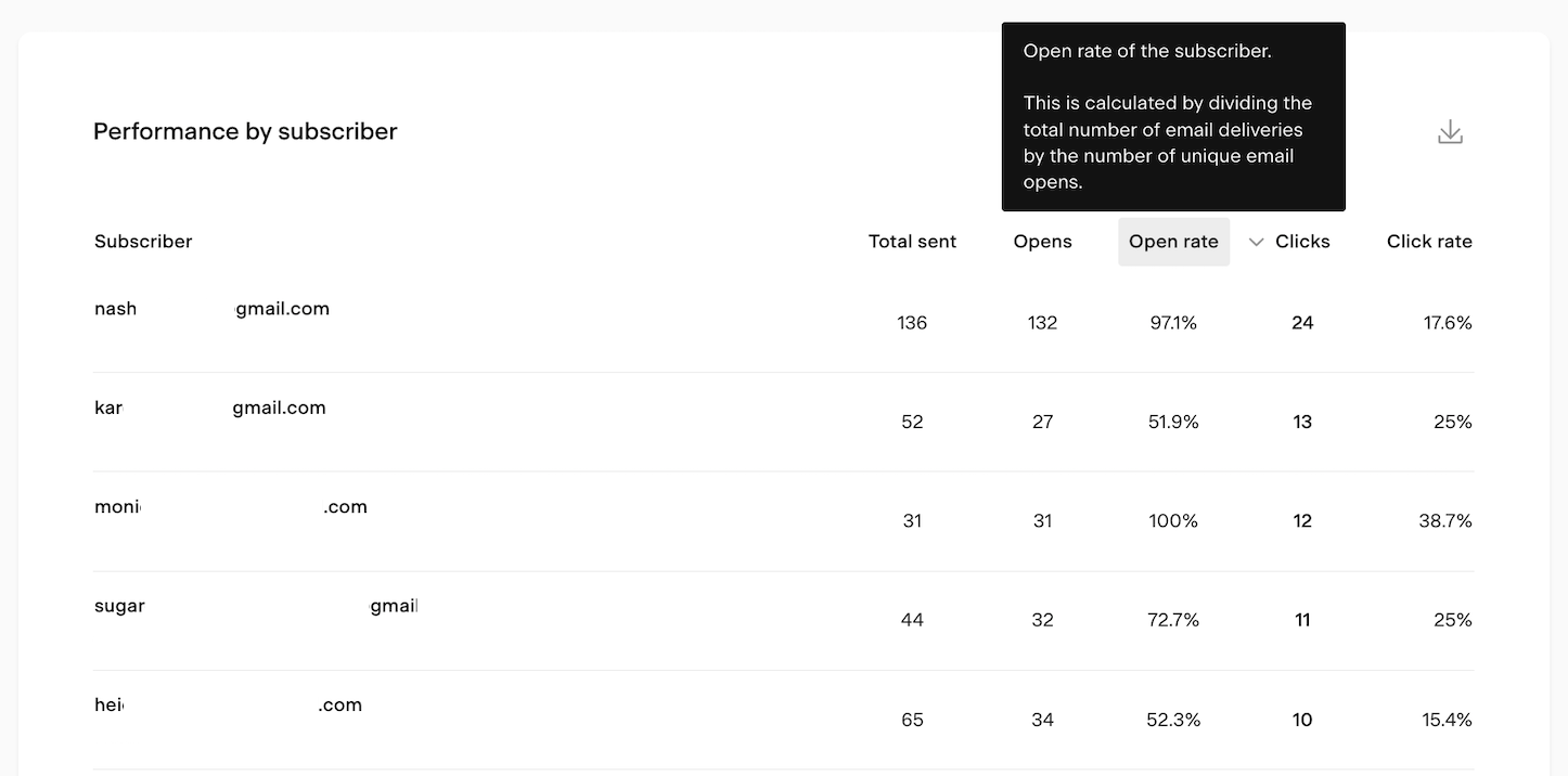
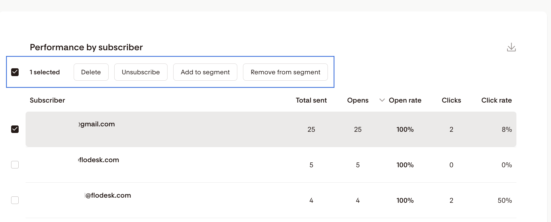
Performance by subscriber table
The Performance by subscriber table shows individual engagement data for each subscriber. Click any column heading to sort by that metric.
Column | What it shows |
|---|---|
Subscriber | The subscriber's email address |
Total sent | Total emails sent to them (including workflow emails) |
Opens | Number of unique emails they've opened |
Open rate | Their individual open rate |
Clicks | Number of unique emails they've clicked |
Click rate | Their individual click rate |
Bulk actions on subscribers
From the Performance by subscriber table, you can select subscribers and apply bulk actions:
Action | What it does |
|---|---|
Delete | Permanently removes the selected subscribers from your entire list and any segments they belong to. This cannot be undone and the records cannot be retrieved. |
Unsubscribe | Unsubscribes the selected subscribers from your list and all segments. They won't receive emails unless they resubscribe. You can't add them back manually. |
Add to segment | Adds the selected subscribers to one or more segments |
Remove from segment | Removes the selected subscribers from one or more segments |
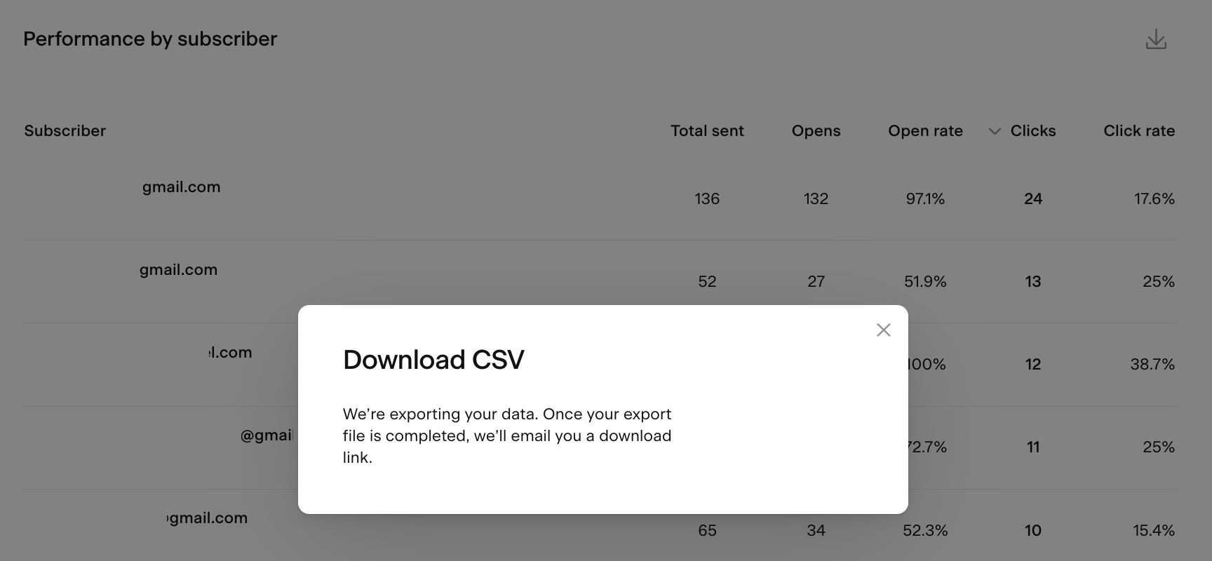
How to export subscriber analytics data
You can export data from the bar charts, chart pop-ups, and both tables as a CSV file. Click the download icon on any of these elements to request an export. You'll receive an email with a link to download the file.
Note: the download link expires after 24 hours. If you miss the window, you'll need to generate a new export.
FAQ
Where do I find my subscriber analytics in Flodesk?
Go to Analytics > Subscribers. The dashboard is available on all Flodesk plans.
What counts as an active subscriber in Flodesk?
An active subscriber is someone who hasn't unsubscribed, bounced, or marked your emails as spam. Only active subscribers are eligible to receive your emails.
What's the difference between "new subscribers" and "total active subscribers" in the chart?
New subscribers shows how many people joined your list within the selected time period. Total active subscribers shows the running total of your entire active list at any point during that period. For example, if you had 300 subscribers last week and gained 50 this week, new subscribers this week is 50 and total active subscribers is 350.
How do I see where my subscribers are coming from?
In the Subscriber growth chart, toggle on Show source. This breaks down new subscribers by how they joined, including form opt-ins, Checkout purchases, CSV uploads, manual entry, and integrations.
Can I take action on subscribers directly from the analytics dashboard?
Yes. In the Performance by subscriber table, you can select subscribers and apply bulk actions: delete, unsubscribe, add to segment, or remove from segment.
What happens when I delete a subscriber from the analytics dashboard?
Deleting a subscriber permanently removes them from your entire list and any segments they belong to. This action can't be undone and the records can't be retrieved. If you want to stop someone from receiving emails without permanently removing them, use the Unsubscribe action instead.
Can I export my subscriber analytics data?
Yes. Click the download icon on any chart or table to export a CSV file. You'll receive an email with a download link. Note that the link expires after 24 hours, so download the file promptly.
What should I do if my subscriber growth is slowing down?
A few things to consider: refresh or update your opt-in form offer, make sure your form is placed in prominent spots on your website, or promote your freebie more widely. You can also check the Forms analytics page to see how each of your forms is converting.