
Getting started with Flodesk Analytics
Overview
Flodesk Analytics gives you a detailed view of how your subscribers, emails, forms, workflows, and checkouts are performing, all in one place. You can track trends over time, compare metrics side by side, and export data when you need it.
This article explains how to navigate the Analytics dashboard and what each chart type shows you.
Note: all data across the Analytics dashboard is displayed based on the timezone set in your account settings.
How to access your analytics
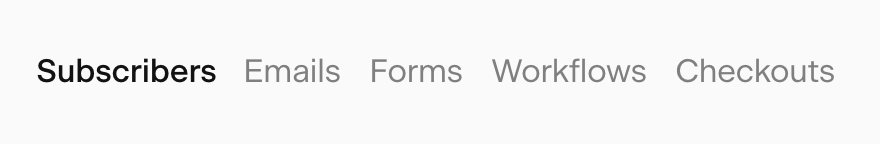
Click the Analytics tab in the top navigation bar of your Flodesk dashboard. From there, you can access five dedicated pages: Subscribers, Emails, Forms, Workflows, and Checkouts.
The five analytics pages
Each analytics page focuses on a specific area of your Flodesk account:
Page | What it covers |
|---|---|
Subscribers | List growth, subscriber sources, segment performance, and individual engagement |
Emails | Email send activity, open and click rates, best send times, and performance by email |
Forms | Form visitors, opt-in rates, conversion rates, and performance by form |
Workflows | Workflow activity, subscriber entries and completions, and performance by workflow email |
Checkouts | Checkout visitors, orders, revenue, and performance by checkout |
Each page includes high-level metric cards at the top for a quick snapshot, followed by charts and tables for deeper analysis.
Chart types explained
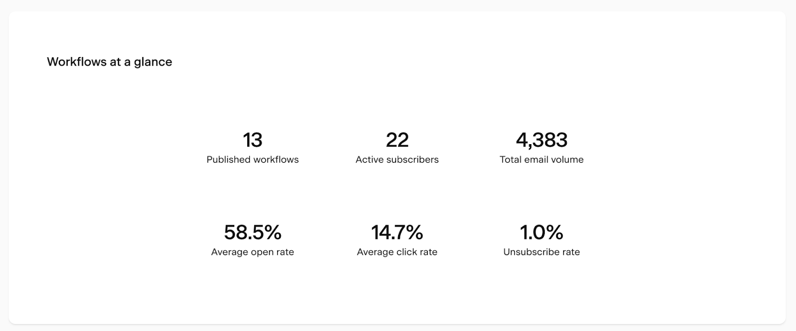
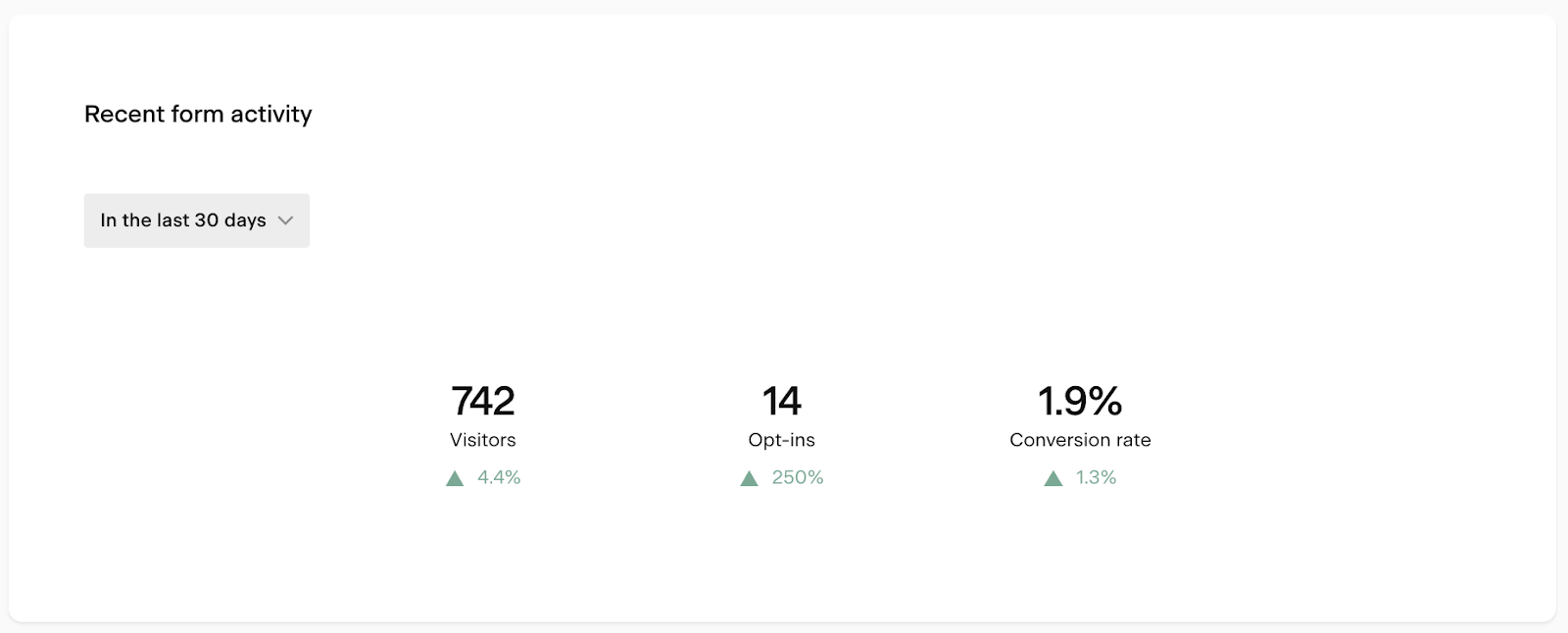
Metric cards
Metric cards appear at the top of each analytics page and give you an instant, high-level view of the most important numbers for that area, without any filtering or setup needed.
For example, the Workflows metric card shows how many subscribers are currently active in your workflows and what your average open and click rates are.
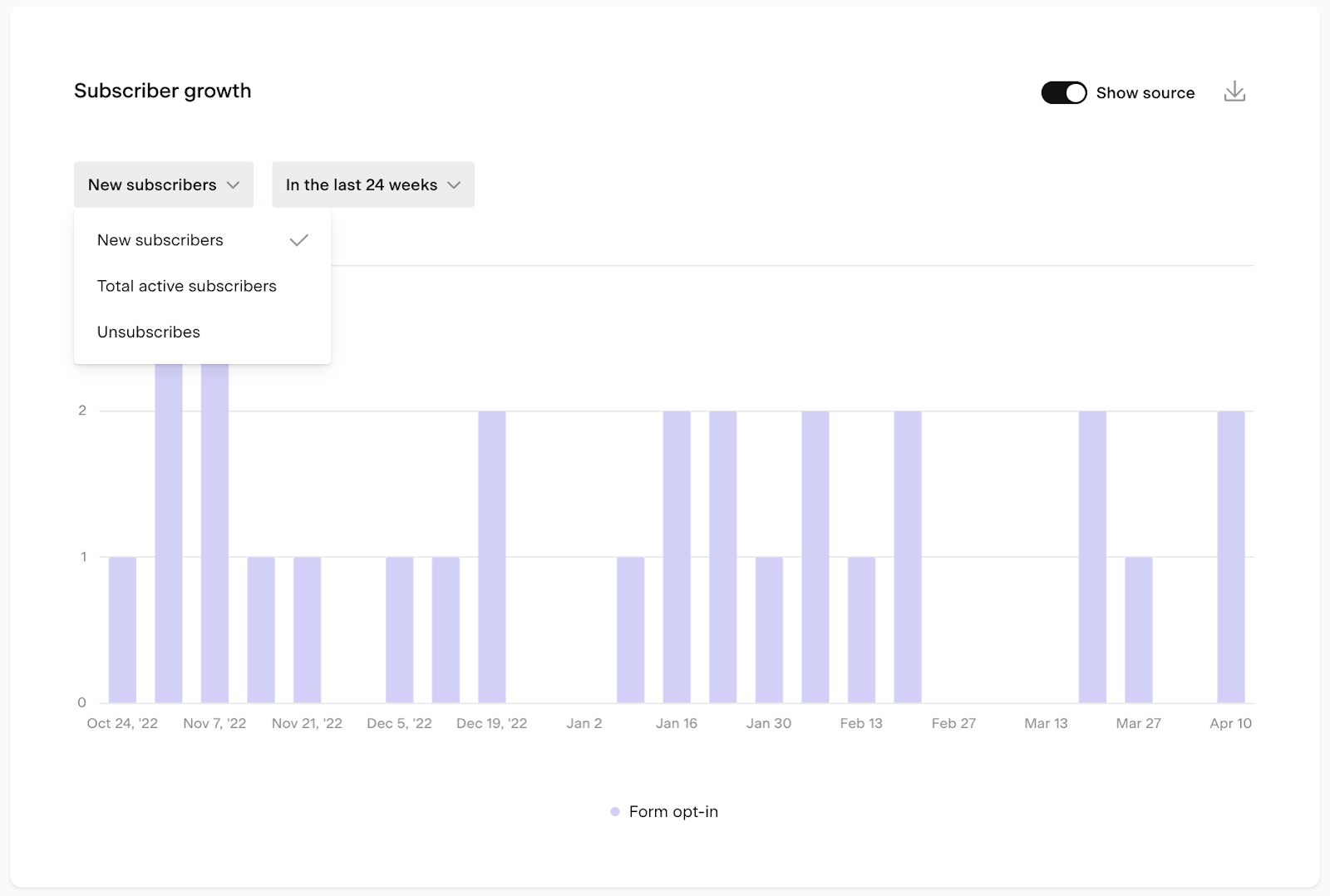
Bar charts
Bar charts show the volume or trend of a specific metric over a selected time period. Each bar chart has three controls:
Metric dropdown: choose which metric the bar height represents (for example, new subscribers, total email volume, or clicks)
Time period selector: choose the time unit and range for the chart
Time unit | Available ranges |
|---|---|
Daily | 7 days, 14 days, 30 days, custom |
Weekly | 8 weeks, 12 weeks, 24 weeks, custom |
Monthly | 6 months, 12 months, 24 months, custom |
Yearly | All years |
Group-by toggle: break the data down into subgroups (for example, by source or by individual workflow). The groupings appear as colored segments within each bar.
Tips for using bar charts:
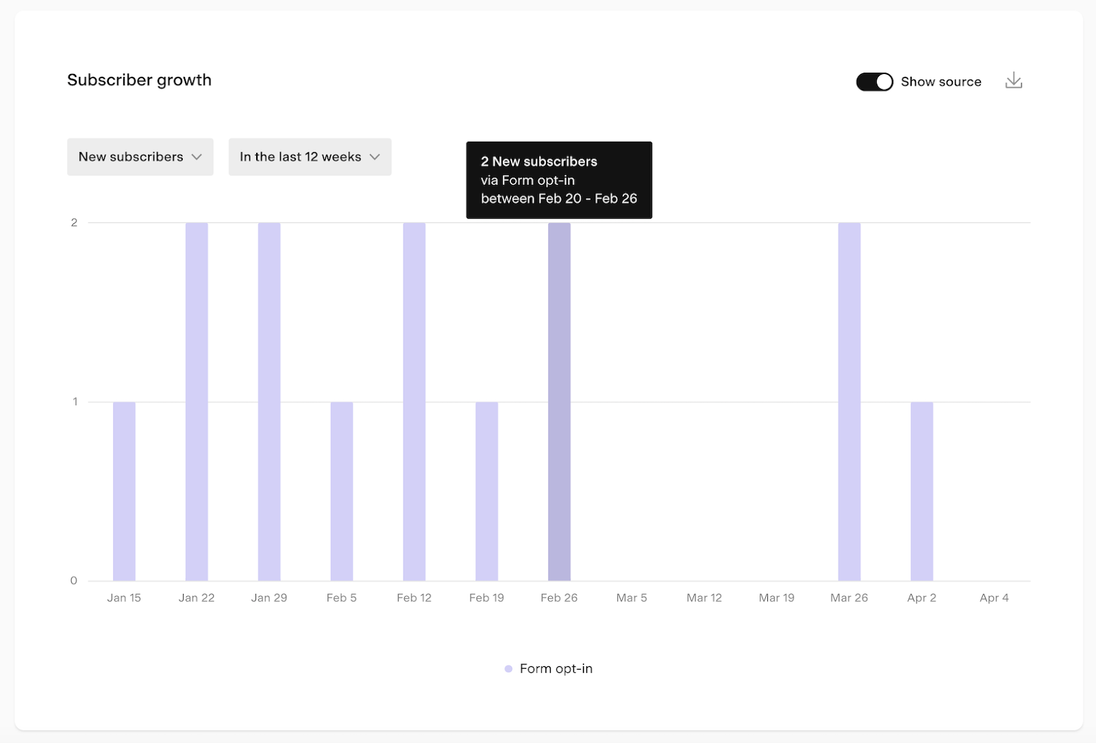
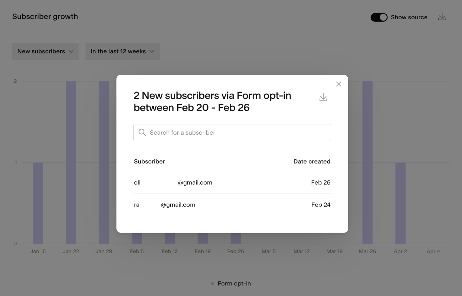
Hover over any bar to see a tooltip with the exact numbers for that period
Click on a bar to open a detailed pop-up view, which you can also export as a CSV
When the group-by toggle is on and there are many items (such as many form names, workflow names, checkout names), the chart shows the top 10 by volume and groups the rest as "Other"
Comparative metric charts
Comparative metric charts show whether a metric is trending up or down by comparing a recent period to the previous equivalent period. They display the percentage change (positive or negative) so you can spot patterns quickly.
You can compare the last 7 or last 30 complete days against the previous 7 or 30 days.
For example, the comparative chart on the Forms analytics page shows whether you gained more opt-ins in the last 30 days compared to the 30 days before that.
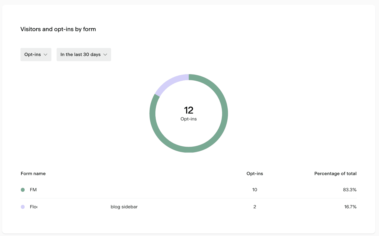
Pie charts
Pie charts show how a metric is distributed across different groups, for example, what percentage of your form opt-ins came from each form.
Hover over any slice to see a tooltip with the data for that group
When there are many items, the chart shows the top 10 by volume and groups the rest as "Other"
Note: clicking into a pie chart to open a pop-up view isn't available (unlike bar charts)
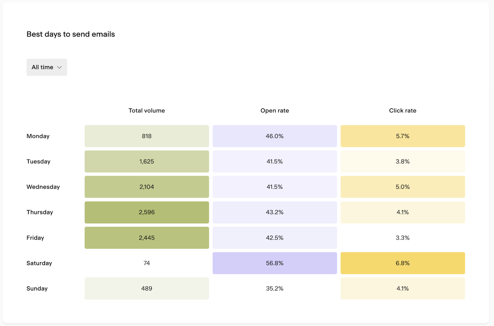
Heat map charts
Heat map charts use color intensity to show patterns across two dimensions, such as day of the week and time of day.
For example, the Best days to send emails heat map on the Emails analytics page shows which days and times tend to get the highest open and click rates, so you can schedule your sends for when your audience is most likely to engage.
Select the relevant time period from the dropdown to adjust the data shown.
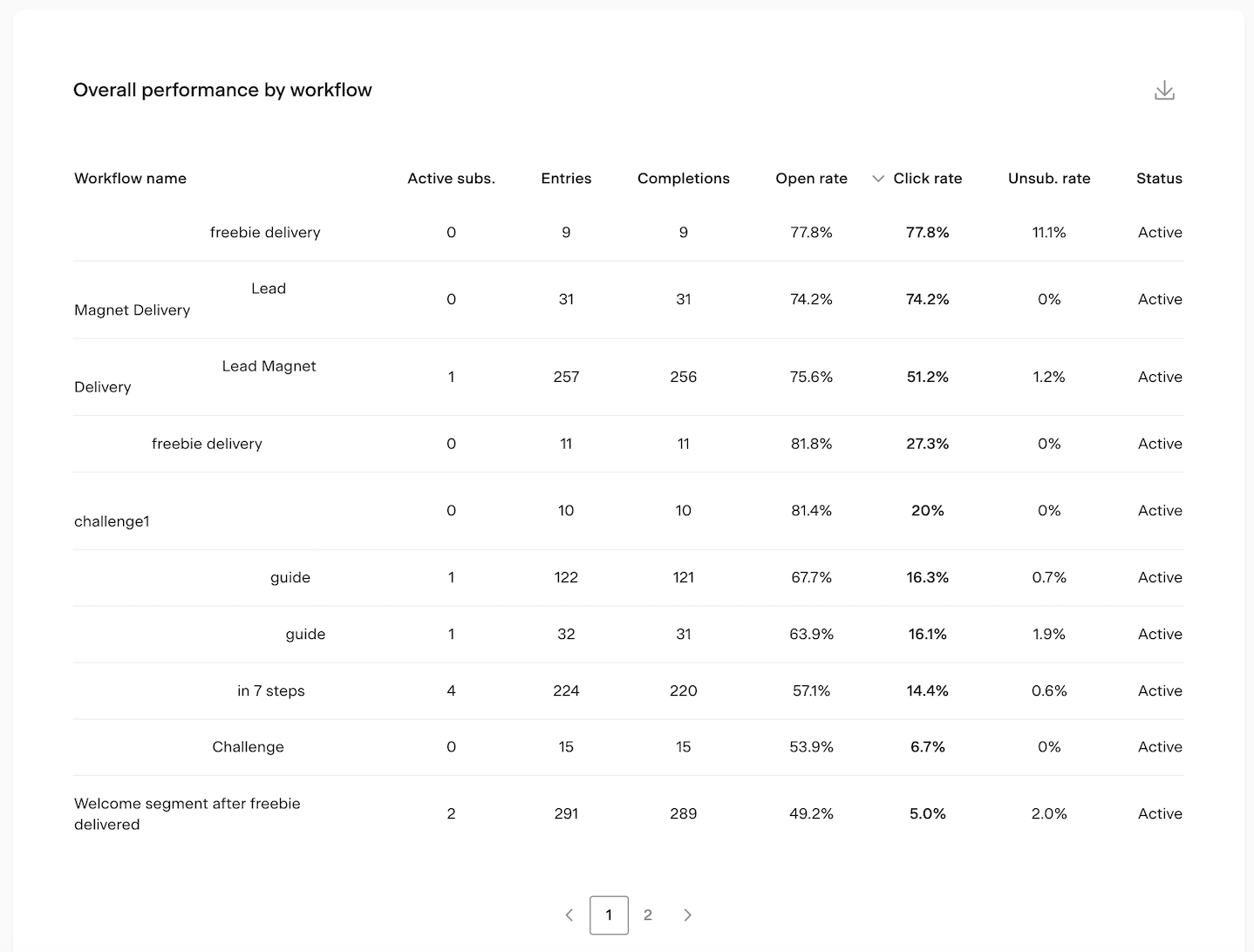
Tables
Tables let you compare metrics across multiple items in a sortable, scannable format. You can:
Click any column heading to sort the table by that metric
Hover over any column heading to see a tooltip explaining what that metric means
Export the table data as a CSV using the download icon
Here’s a table example from the Workflows analytics page, comparing the overall performance of your workflows based on key metrics.
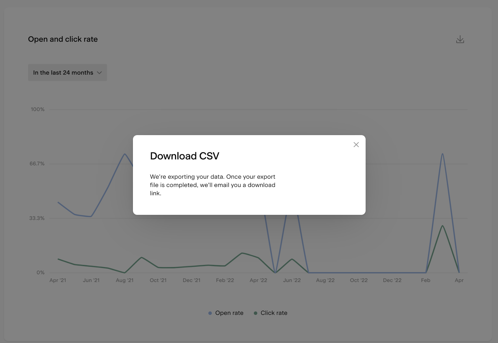
How to export analytics data
You can export data from bar charts, bar chart pop-ups, and tables as a CSV file. Click the download icon on any of these elements to request an export. You'll receive an email with a link to download the file.
Note: the download link expires after 24 hours. If you miss the window, you'll need to generate a new export.
FAQ
Where do I find the Analytics dashboard in Flodesk?
Click the Analytics tab in the top navigation bar of your Flodesk dashboard. From there, you can navigate to five pages: Subscribers, Emails, Forms, Workflows, and Checkouts.
What analytics pages are available in Flodesk?
There are five analytics pages: Subscribers (list growth and engagement), Emails (send activity and performance), Forms (visitors and conversion rates), Workflows (automated email performance), and Checkouts (sales and revenue).
What is the difference between the metric cards and the charts on the analytics pages?
Metric cards appear at the top of each page and give you a quick, high-level snapshot of the most important numbers with no setup needed. The charts and tables below them let you dig deeper, filter by time period, and compare performance across different items.
How do I change the time period shown in a bar chart?
Use the time period selector on the bar chart to choose both the time unit (daily, weekly, monthly, or yearly) and the range (for example, last 30 days or last 12 weeks). You can also select a custom date range.
What does the group-by toggle do in a bar chart?
The group-by toggle breaks the bar chart data down into subgroups, shown as colored segments within each bar. For example, on the Subscribers page, turning it on shows new subscribers broken down by source (form opt-in, CSV upload, and so on). The chart shows the top 10 groups by volume, with any remaining grouped as "Other."
Can I export my analytics data from Flodesk?
Yes. Click the download icon on any bar chart, bar chart pop-up, or table to export a CSV file. You'll receive an email with a download link. The link expires after 24 hours, so download the file promptly. Note that pie charts and heat map charts don't currently support CSV export.
What time zone is my analytics data based on?
All analytics data is displayed based on the timezone set in your Flodesk account settings.
What is a comparative metric chart?
A comparative metric chart shows whether a metric is trending up or down by comparing a recent period (last 7 or 30 days) to the previous equivalent period. It shows the percentage change so you can quickly see whether things are improving or declining.
Why does my bar chart only show 10 items when I have more?
When the group-by toggle is on and there are more than 10 items (such as many form names or workflow names), the chart shows the top 10 by volume and groups the remaining items as "Other." This keeps the chart readable. For the full breakdown, export the data as a CSV.